Mobile Caption Typography: 5 Essential Rules for 2026
5 Typography Mistakes Ruining Mobile Caption Readability (2026) Fancy bouncing captions don't increase watch time—they kill it. Yet I still see editors in Adobe Premiere Pro burning three hours every
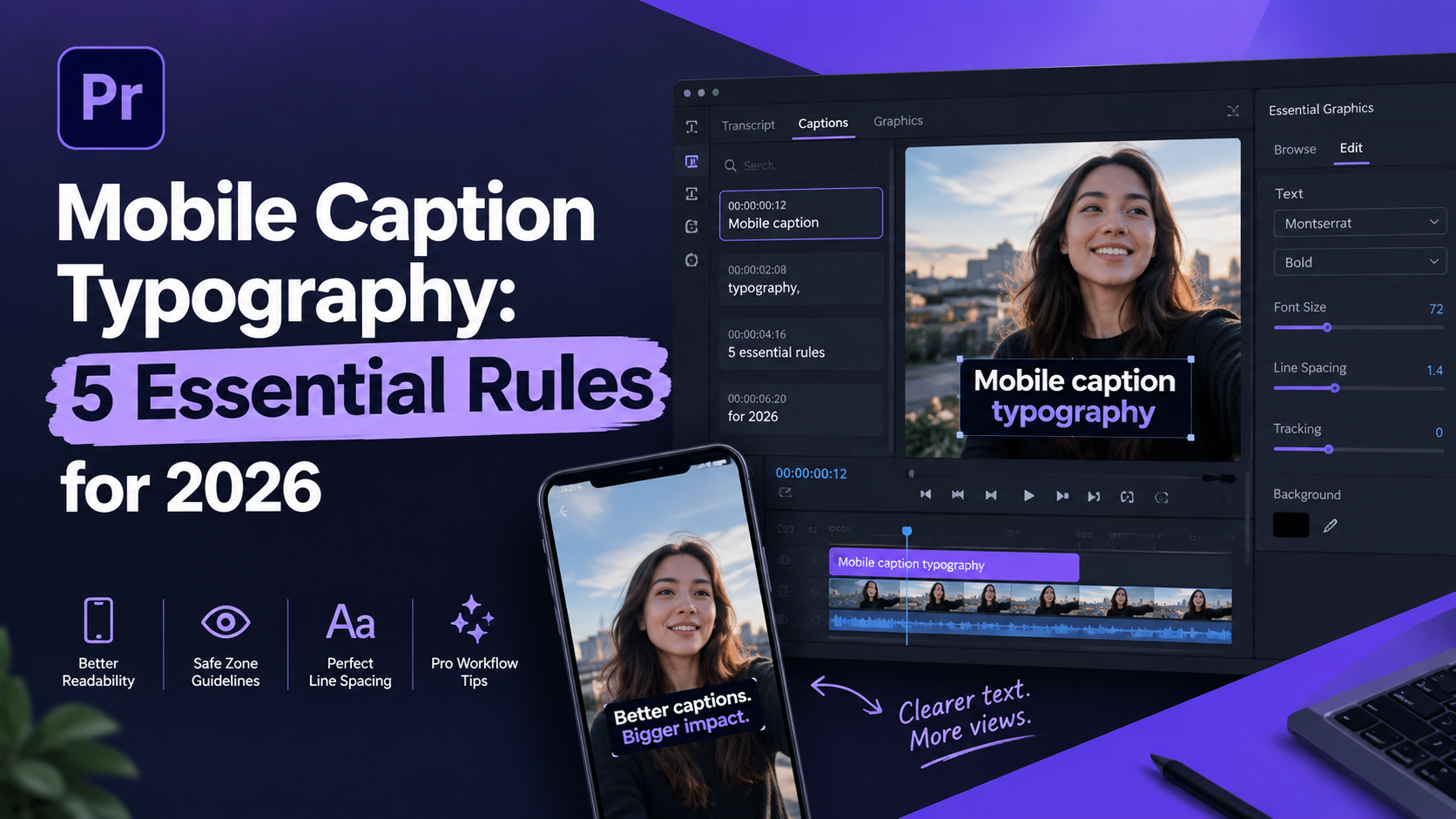
5 Typography Mistakes Ruining Mobile Caption Readability (2026)
Fancy bouncing captions don't increase watch time—they kill it. Yet I still see editors in Adobe Premiere Pro burning three hours every week formatting vertical subtitles like they are building cinematic movie credits [5]. If your viewer has to squint or read past a TikTok overlay, they swipe away in under two seconds [6]. I spent years manually tweaking text layers in Premiere before realizing my fancy font choices were tanking client retention graphs.
When you spend four hours cutting a long-form podcast into vertical clips, bad subtitle choices kill your watch time instantly [10]. Typography isn't just a visual detail. It's the visual engine of short-form retention [5]. Here is how poor mobile typography ruins your reach and how to fix it in your Premiere Pro workflow.
Key Takeaways
Over 80% of mobile viewers watch video content with audio muted, making readable captions your primary driver for viewer retention [5].
Bold sans-serif fonts (weight 700+) increase mobile readability by 31% and reading speed by 12% compared to decorative or serif typefaces [5].
Cap your caption chunks at 3 to 5 words per line (32 to 42 characters max) to match human visual scanning habits on smartphone screens [9], [10].
Keep text within the middle safe zone to prevent TikTok, Reels, and YouTube Shorts UI overlays from hiding your words [6].
White text over a solid or semi-transparent black background box yields a 21:1 contrast ratio, completely dominating basic accessibility requirements [6].
Use WASM real-time preview workflows inside Adobe Premiere Pro extensions to style captions instantly without waiting on render loops.
Why Mobile Captions Drive Retention (And How Bad Typography Kills It)
If you edit video for a living, you know raw audio is only half the battle. Industry data indicates that 92% of online video consumers stream content daily [8], but 85% of Facebook and social media views happen in total silence [6]. When viewers encounter a video on a mobile screen, their eyes scan for instant text comprehension before deciding whether to stay [10].
Good typography works invisibly. When captions are formatted correctly, the viewer's brain processes the text automatically without diverting attention from the video [5]. But when typography fails, cognitive friction spikes immediately [3].
The result? The viewer has to work to read your message. On mobile apps, extra visual work triggers an immediate swipe [10].
[[STAT:80%:of social media users watch mobile videos with audio turned off]]
The Mute-First Viewing Reality
We edit audio on high-end studio monitors. But our audience consumes our work on smartphone displays in noisy coffee shops, crowded subways, or quiet bedrooms. In these real-world settings, captions aren't an optional accessibility feature—they're the main interface [6].
Research shows that adding properly formatted subtitles can increase video completion rates by up to 40% [6]. In fact, 80% of users are more likely to finish a video when captions are present [8].
Typography as a Retention Mechanic
Default speech-to-text engines are built for baseline transcription accuracy, not visual design [10]. Unedited automated captions often display timing errors on 1 in 3 words and cap out at 60% to 70% accuracy [9].
When you dump unformatted transcript blocks onto a 1080x1920 canvas, you force the audience to digest dense paragraphs instead of punchy ideas [10]. Styled captions designed for micro-attention spans can boost video watch time by 42% on identical video content [10].
Actionable Takeaway: Treat caption styling as a retention tool rather than an aesthetic footnote by prioritizing fast scanning over decorative design choices [5], [10].
Mistake 1: Using Fancy Script or Serif Fonts
The fastest way to ruin a vertical short is to pick a decorative cursive font, a thin script, or a delicate serif typeface [5]. They might look elegant on a 27-inch 4K desktop monitor during editing. But they break down completely when rendered on a six-inch phone screen [2].
+-------------------------------------------------------------------+
|                     CAPTION FONT PERFORMANCE                      |
+---------------------+-------------------+-------------------------+
| Font Category       | Mobile Legibility | Reading Speed Impact    |
+---------------------+-------------------+-------------------------+
| Script / Cursive    | Very Poor         | Slows reading by 25%+   |
| Decorative Serif    | Poor              | Baseline reading speed  |
| Clean Sans-Serif    | Excellent         | +12% speed boost [5]    |
| Bold Sans-Serif 700+| Superior          | +31% legibility gain [5]|
+---------------------+-------------------+-------------------------+
Why Decorative and Serif Fonts Fail on Small Screens
Serif typefaces feature small decorative strokes at the ends of character stems [1]. At lower mobile display resolutions or scaled video viewports, these fine serifs blur together, creating visual noise [2].
Decorative and cursive fonts distort character shapes even further [1]. When viewers spend cognitive energy deciphering whether a letter is an "e", an "a", or an "o", their reading pace slows down [3].
The Power of Bold Sans-Serif Typefaces
Controlled eye-tracking research proves that sans-serif fonts increase subtitle reading speed by 12% [5] compared to serif typefaces in digital video environments. Furthermore, large-scale studies by Adobe and the Readability Consortium demonstrate that matching clean font layouts to individual reading needs boosts text comprehension by 35% [4].
Using bold font weights (weight 700 or higher) makes text 31% more readable on mobile screens [5]. Heavy sans-serif typefaces like Montserrat Bold, Inter ExtraBold, Roboto Heavy, and Poppins Bold create strong geometric letterforms that stand out against complex video backgrounds [5].
Pro Tip: Never use script fonts for technical or fast-paced captions. Stick to heavy sans-serif typefaces with open apertures and high x-heights to maximize character recognition at a glance [5].
Actionable Takeaway: Standardize your mobile video presets on bold sans-serif typefaces with a font weight of 700 or higher [5].
Mistake 2: Placing Text in UI Overlay Dead Zones
You spend an hour fine-tuning your subtitle styling in Adobe Premiere Pro. You export the file, upload it to TikTok or Instagram Reels, and discover the platform UI covers half your text [6]. This is one of the most common rookie mistakes in short-form editing [9].
+-------------------------------------------------------------------+
|                  VERTICAL VIDEO SAFE ZONE GRID                    |
+-------------------------------------------------------------------+
| [ Top 15% Screen ]  --> Platform Header / Search Controls        |
|-------------------------------------------------------------------|
|                                                                   |
| [ Middle 60% Screen ] --> OPTIMAL CAPTION SAFE ZONE               |
|                           (Center Aligned, 55pt - 75pt Text)      |
|                                                                   |
|-------------------------------------------------------------------|
| [ Bottom 25% Screen ]--> Usernames, Captions, Sound Titles,       |
|                          Like/Share UI Overlays (DEAD ZONE)       |
+-------------------------------------------------------------------+
Navigating Platform UI Overlays on TikTok, Reels, and Shorts
Mobile video apps place heavy interface graphics directly over your video [6]. TikTok places usernames, audio titles, and long text descriptions across the lower 25% of the viewport, with interaction buttons stacked down the right margin [6]. Instagram Reels and YouTube Shorts use similar native overlays [6].
If your caption text lands in these dead zones, platform elements render directly over your words. That renders them completely unreadable [9].
Setting Up the Center Safe Zone
To guarantee visibility across platforms, position your captions inside the middle third of the vertical frame [6]. Professional broadcast standards suggest keeping captions within the middle 80% of screen width and at least 60 pixels clear of screen boundaries [6].
For short-form vertical videos (1080x1920), position text bounding boxes slightly above the lower third [6], [9]. This placement keeps the center of the visual action clear while ensuring platform UI icons never collide with your text [6].
Actionable Takeaway: Turn on vertical safe margin guides in your editing software to ensure caption blocks stay well clear of the lower 25% dead zone [6], [9].
Mistake 3: Dumping Multi-Line Sentence Blocks on Screen
When creators use default auto-caption tools, the software usually spits out full sentence blocks containing 10 to 15 words across three lines [10]. Dumping full paragraphs onto a vertical video screen ruins visual pacing and forces the audience to read instead of watching [9], [10].
BAD: Full Paragraph Block (High Cognitive Load)
+----------------------------------------------------+
| So basically what we realized after testing this   |
| strategy for three months was that our retention   |
| dropped whenever the captions got too long.        |
+----------------------------------------------------+
GOOD: Concise Word Chunks (Instant Scanning)
+----------------------------------------------------+
|          This strategy changed everything          |
|                 (3-5 Words / Chunk)                |
+----------------------------------------------------+
The Problem with Paragraph Subtitles on Vertical Video
Human visual processing on mobile screens works in rapid, micro-saccadic scans [10]. When a screen displays three lines of continuous text, the viewer's visual focus jumps from the video action to the caption block, triggering high cognitive fatigue [3], [10]. The eye has to read the text like a book page, breaking the immersive flow of the video clip [10].
Optimal Word Chunking for Micro-Attention Spans
Professional short-form editors enforce strict word limits per caption display [9], [10]. The ideal density for mobile captions is 3 to 5 words per line, capped at a maximum line length of 32 to 42 characters per chunk [9].
+-------------------------------------------------------------------+
|                     CAPTION DISPLAY BENCHMARKS                    |
+---------------------+-------------------+-------------------------+
| Parameter           | Recommended Spec  | Source Standard         |
+---------------------+-------------------+-------------------------+
| Words Per Line      | 3 to 5 Words      | Short-form Best Practice|
| Line Character Cap  | 32 to 42 Chars    | Evelize / OpusClip [9][6]|
| Mobile Font Sizing  | 55pt to 75pt      | RenderCut Mobile [5]    |
| Display Duration    | 1 to 7 Seconds    | Evelize Guidelines [9]  |
+---------------------+-------------------+-------------------------+
Syncing concise word chunks closely with the speaker's natural vocal rhythm maintains visual momentum [9], [10]. Keeping caption lines short allows viewers to absorb words in milliseconds while staying focused on the speaker's face and visual b-roll [10].
Pro Tip: Format high-energy hooks with 1 to 3 words per line, then transition to 3 to 5 words for narrative delivery [9], [10].
Actionable Takeaway: Enforce a strict 5-word cap per caption line to keep screen space open and visual energy high [9], [10].
Mistake 4: Low Contrast Ratios That Bleed Into Dynamic Backgrounds
Floating white text without drop shadows, strokes, or background containers is a recipe for unreadable captions [9], [10]. A font color that looks legible over a dark jacket becomes invisible when the speaker steps into a brightly lit room or passes white background graphics [9].
+-------------------------------------------------------------------+
|                    CONTRAST RATIO COMPARISONS                     |
+------------------------------------+------------------------------+
| Styling Setup                      | Contrast Ratio Performance   |
+------------------------------------+------------------------------+
| White Text on Unprotected Video    | Fails WCAG Standards (1:1)   |
| White Text + Subtle Drop Shadow    | Marginally Meets AA (3:1)    |
| WCAG 2.1 Level AA Standard         | Minimum Required (4.5:1) [1] |
| White Text on Solid Black Box      | Maximum Legibility (21:1) [6]|
+------------------------------------+------------------------------+
Why White Text Without Shadows or Background Boxes Fails
Web Content Accessibility Guidelines (WCAG 2.1 Level AA) require a minimum color contrast ratio of 4.5:1 for standard text [1]. Pure white text rendered directly on top of variable video footage constantly fails this accessibility standard as background luminosity shifts [5].
| Before | 4.5 |
|---|---|
| After | 1 |
Achieving the 21:1 High-Contrast Sweet Spot
To achieve bulletproof legibility on dynamic video, place white text over a solid or semi-transparent black background container [5], [9]. Pure white text (#FFFFFF) on a solid black background box (#000000) delivers a 21:1 contrast ratio, representing the highest possible legibility score [6].
If you prefer floating captions without background boxes, apply a heavy 2px to 4px dark stroke outline or a dense drop shadow [5]. Adding a 60% opacity dark background container ensures your captions remain crisp and readable regardless of background lighting shifts [5], [9].
Actionable Takeaway: Always apply a semi-transparent dark background box or a solid stroke outline to ensure high text contrast across all frames [5], [9].
Mistake 5: Over-Animating Captions with Constant Word Motion

When editors discover kinetic caption tools, they often go overboard [10]. Having every single word bounce, spin, pulse, or flash neon colors creates visual exhaustion [10].
+-------------------------------------------------------------------+
|                   CAPTION ANIMATION PERFORMANCE                   |
+---------------------+-------------------+-------------------------+
| Motion Style        | Cognitive Impact  | Retention Result        |
+---------------------+-------------------+-------------------------+
| Constant Word Bounces| High Strain       | Increased Swipe Rates   |
| Rapid Color Shifts  | Visual Noise      | Reader Distraction      |
| Subtle Pop In       | Clean Emphasis    | High Comprehension      |
| Word Highlighting   | Focused Anchor    | Peak Viewer Retention   |
+---------------------+-------------------+-------------------------+
Visual Fatigue and Kinetic Text Overdose
Over-animating subtitle text creates visual noise [10]. When words bounce constantly, the viewer's brain spends extra effort tracking movement rather than comprehending ideas [3], [10]. So excessive word animation distracts from spoken narrative and leads to higher drop-off rates on long-form content [9], [10].
Subtle Animations That Retain Viewers
Restraint is the hallmark of professional captioning [10]. Shift away from aggressive motion transitions toward clean pop-ins or subtle fade effects [10].
Use selective color highlighting to draw attention to single emphasis words within a sentence block [9], [10]. Highlighting a key word in yellow or cyan creates a visual focal point, helping viewers scan sentences effortlessly without suffering from motion fatigue [9], [10].
Expert Insight: "Captions are meant to be plain and functional. If a viewer is actively focusing on how a font bounces or shifts, their brain is no longer digesting your video's core message." — Accessibility & Subtitling Best Practice [9]
Pro Tip: Limit word animations to simple scale-pops on key emphasis words, leaving function words styled statically [10].
Actionable Takeaway: Ditch hyper-animated word effects in favor of clean pop-in transitions with selective single-word color highlights [9], [10].
How to Fix Mobile Caption Typography in Adobe Premiere Pro
Fixing caption legibility manually in Adobe Premiere Pro can be tedious [10]. Creating custom graphic layers, adjusting bounding boxes, setting stroke weights, and manually splitting timing cuts can add up to 4 hours per project.
+-------------------------------------------------------------------+
|               CAPTION WORKFLOW TIME COMPARISON                    |
+----------------------------------+--------------------------------+
| Workflow Method                  | Time Spent Per 30-Min Podcast  |
+----------------------------------+--------------------------------+
| Manual Keyframing & Text Formatting| 4 Hours Manual Labor           |
| Basic Auto-Captions + Manual Fixes| 90 Minutes Editing             |
| KreateFlo v1.0.3 CaptionFlow     | 90 Seconds Automated Styling   |
+----------------------------------+--------------------------------+
Building a Fast Native Subtitle Template
If you stick strictly to native tools inside Premiere Pro, build a dedicated Essential Graphics style preset:
Open the Text panel and select Transcribe Sequence.
Click Create Captions and set maximum length to 32 characters, choosing Single Line.
Highlight your caption track and open the Essential Graphics panel.
Select a bold sans-serif font like Montserrat, set font weight to Bold (700), size to 65pt, and center-align the text.
Enable Fill (White #FFFFFF), add a Stroke (Black #000000, 3px), and add a Background Box (Black #000000 at 60% opacity).
Click Track Style and select Create Style to lock this template for future sequences.
Native Premiere styles work well for basic captioning. But updating animated karaoke-style pop effects word-by-word across 30 short clips still requires hours of manual keyframing.
Automating Styles with KreateFlo's CaptionFlow
For editors managing heavy video workloads, manual caption tweaking is a bottleneck. We built CaptionFlow into KreateFlo v1.0.3 as a native Adobe Premiere Pro CEP extension plugin.
Instead of jumping out to web apps like Descript or paying FireCut's per-hour billing rates, KreateFlo runs directly inside your Premiere workspace.
+-------------------------------------------------------------------+
|              PREMIERE PRO PLUGIN FEATURE COMPARISON               |
+-------------------+--------------------+--------------------------+
| Feature / Tool    | Standard Native    | KreateFlo v1.0.3 Pro     |
+-------------------+--------------------+--------------------------+
| Execution Type    | Built-in Panel     | Native CEP Extension     |
| Real-Time Preview | Render-to-See Loop | Real-time WASM Engine    |
| Animated Presets  | Manual Keyframes   | 22 One-Click Presets     |
| Multi-Cam Speakers| Manual Cuts        | Up to 8 Auto-Speakers    |
| Monthly Cost      | Included in CC     | $19.99/mo (20 AI Hours)  |
+-------------------+--------------------+--------------------------+
With CaptionFlow, you get access to 22 animated caption presets engineered specifically for vertical mobile viewing. It uses a real-time WebAssembly (WASM) preview engine, letting you scrub through caption animations in 90 seconds instead of rendering keyframes for 4 hours.
+--------------------------------------------------------------------+
|                   KREATEFLO v1.0.3 PRICING TIERS                   |
+-----------------+------------------+-------------------------------+
| Tier            | Price            | Included Tools & Hours        |
+-----------------+------------------+-------------------------------+
| Free Tier       | $0 / Forever     | 3 Core Tools (Silence Remover,|
|                 |                  | Transition Assist, Copy-Paste)|
| Pro Tier        | $19.99 / month   | 33+ Tools, 20 AI Hours/mo     |
| Studio Tier     | $44.99 / month   | 33+ Tools, 50 AI Hours/mo     |
+-----------------+------------------+-------------------------------+
Look, I'll be honest. If you only edit one 60-second clip a month, KreateFlo isn't for you. Stick to Premiere's native Text panel and style it manually. And if you prefer working in browser-based text editors rather than staying inside Premiere Pro, web tools like Descript or Opus Clip might fit your workflow better. But if you're editing multiple podcasts or batch-cutting vertical Shorts every week inside Premiere, manual captioning will drain your time fast.
For a detailed breakdown of long-form editing strategies, check out our complete guide on Premiere Pro podcast editing workflow.
Actionable Takeaway: Save your caption styles as reusable templates or leverage real-time plugin extensions to eliminate repetitive manual formatting [5], [10].
Summary of Key Fixes
To fix caption legibility issues across your mobile video campaigns, implement these core styling rules:
Typography: Switch to heavy sans-serif typefaces like Montserrat Bold, Inter, or Roboto [5].
Sizing: Scale captions to 7-9% of vertical frame height (55pt to 75pt for 1080x1920 canvas) [5].
Safe Zones: Position text in the middle third of the frame, clear of platform UI elements [6].
Chunking: Cap line lengths at 3 to 5 words (32 to 42 characters max per block) [9].
Contrast: Combine white text with a dark stroke outline or a 60% opacity background box for 21:1 contrast [5], [6].
Animations: Replace erratic bouncing effects with subtle pop-ins and single-word color highlights [9], [10].
Frequently Asked Questions
What font size is best for mobile video captions?
For vertical 1080x1920 mobile screen viewports, an ideal font size ranges between 55pt and 75pt [5], which translates to roughly 7% to 9% of total frame height [5]. This scale ensures text stays readable on small screens without obscuring visual content [5], [6].
Which fonts are most readable for TikTok, Instagram Reels, and YouTube Shorts captions?
Bold sans-serif fonts such as Montserrat, Inter, Roboto, Poppins, and Arial in font weights of 700 or higher offer optimal legibility [5]. Clean sans-serif styles increase subtitle reading speeds by 12% compared to decorative or serif typefaces [5].
How do you prevent mobile app UI overlays from blocking video captions?
Position captions within the center safe zone of your frame, keeping text at least 60 pixels inside screen margins and well clear of the lower 25% area [6], [9]. This placement prevents usernames, captions, and platform buttons on TikTok, Reels, and Shorts from obscuring your text [6].
What is the recommended contrast ratio for video subtitles?
The WCAG 2.1 AA accessibility standard requires a minimum contrast ratio of 4.5:1 [1], [7]. Placing white text over a solid black background box delivers a 21:1 contrast ratio, providing optimal readability across dynamic background scenes [6].
Why do captions look bad on short-form videos?
Default auto-captions rely on speech recognition engines designed for transcription accuracy rather than visual appeal [10]. Unedited auto-captions display long sentence blocks with poor timing sync, weak font choices, and no keyword highlights, creating visual clutter on mobile screens [9], [10].
Final Thoughts
You don't need to spend four hours hand-tweaking keyframes in Premiere Pro just to make your short-form captions readable. Stick to bold sans-serif fonts, respect app UI safe zones, enforce high contrast, and keep line lengths under 5 words [5], [6], [9].
If you edit high volumes of short clips and want to speed up your editing pipeline, grab KreateFlo v1.0.3 at /download.html to test 3 free tools forever, or upgrade to Pro for $19.99/mo to streamline your entire captioning workflow inside Adobe Premiere Pro.
References
hc.edu/accessibility/basics/typography-readability/ authority
robustbranding.com/font-size-guidelines-for-mobile-readability/
athreon.com/best-practices-for-creating-effective-subtitles-and-captions/amp/
readable.com/blog/new-study-shows-font-readability-is-very-individual/
designhill.com/design-blog/top-5-typography-errors-every-web-designer-avoid/
Try KreateFlo free
3 tools forever, 7-day trial on the rest. No credit card to start.
Download KreateFlo