Social Media Safe Zones: 2026 Guide to Avoid UI Overlap
Avoiding On-Screen UI Overlap with Social Media Captions You spent three hours tweaking animated captions in Adobe Premiere Pro. Then you exported, opened TikTok, and realized the comment button burie
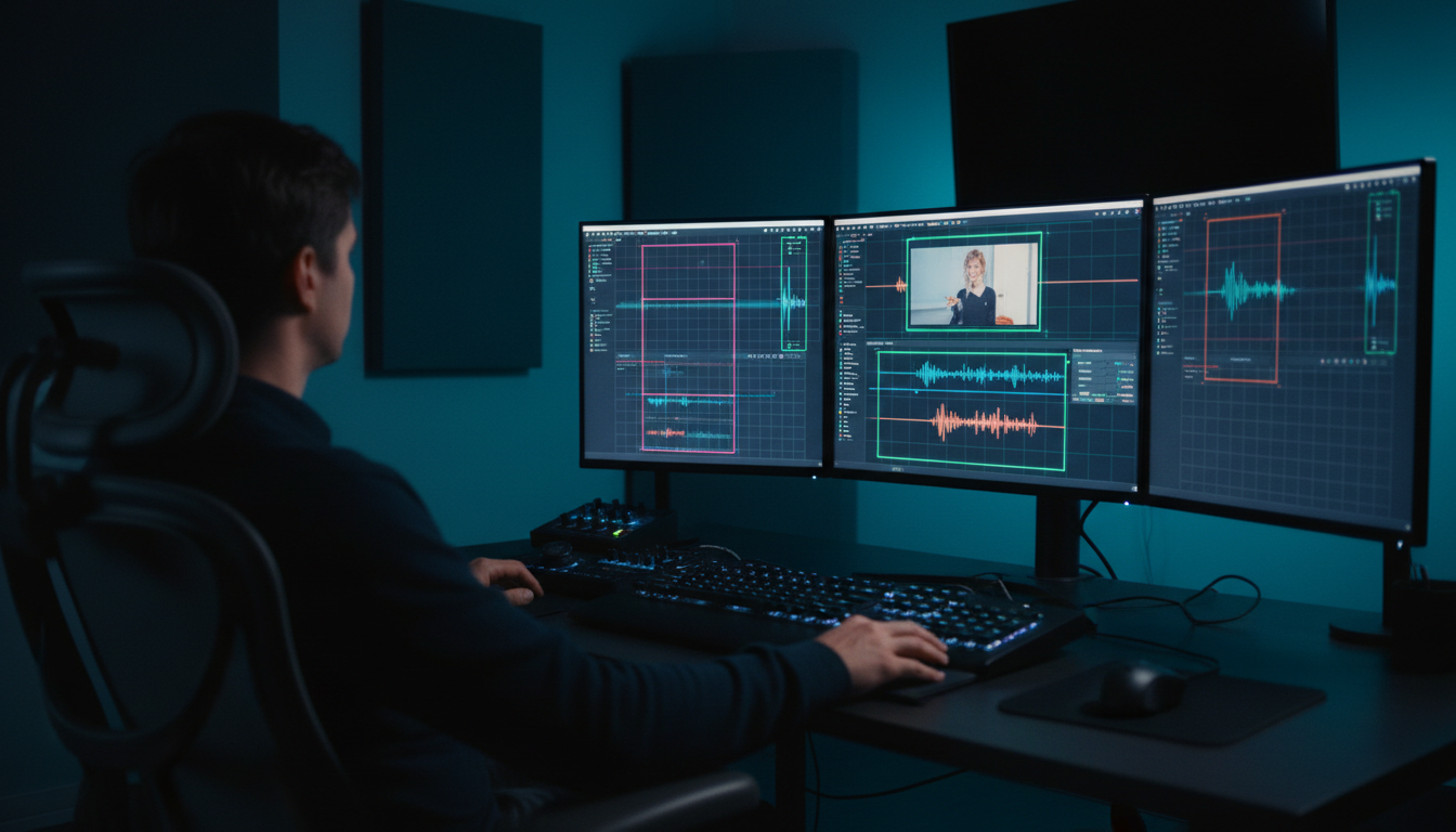
You spent three hours tweaking animated captions in Adobe Premiere Pro. Then you exported, opened TikTok, and realized the comment button buried your call-to-action. I've watched clients throw away thousands in ad spend because 35% of their vertical canvas was obscured by mobile UI.
When you edit standard 16:9 video, you get a clean canvas. But when you crop to a 9:16 vertical sequence, social platforms slap account handles, audio labels, like hearts, and comment bubbles straight over your footage. If your subtitles or offer codes sit in those danger zones, your engagement drops instantly.
In this guide, I'll break down the exact mathematical safe zones you need to avoid on-screen UI overlap with social media captions across TikTok, Instagram Reels, and YouTube Shorts. I'll also show you how to set up protective guide overlays inside Premiere Pro so you can ship a single master export that looks crisp on every feed.
Key Takeaways
- Native mobile app UI overlays cover up to 35% of a standard 1080 x 1920 vertical video frame [2].
- A universal safe zone bounding box of 900 x 1160 pixels prevents text collisions across TikTok, Reels, and Shorts [1].
- Keep key CTA text at least 15% to 35% above the bottom frame edge to clear expanding audio labels and caption boxes [2] [3].
- AI auto-reframing plugins center speaker faces but remain platform-blind to right-margin action icons [3].
- Using transparent PNG safe-zone guides on top video tracks in Premiere Pro saves 2+ hours of re-rendering per project [4].
- CaptionFlow inside KreateFlo v1.0.3 provides instant WASM real-time previews for caption positioning directly on your timeline.
Why Premiere Pro Editors Keep Burning CTAs on TikTok and Reels
The Hidden Cost of Occluded On-Screen Text
I see this mistake every week in client reviews. An editor imports raw podcast footage into Adobe Premiere Pro, cuts a 60-second clip, and adds bright subtitles across the lower third. It looks great on a desktop monitor.
But the second that video goes live on mobile feeds, the platform interface turns your primary headline into an unreadable mess [3]. Viewers swipe away in seconds.
When key elements are blocked, performance metrics take a direct hit. Research shows that 87% of viewers judge brand credibility based on overall video polish and readability [5]. If a prospective buyer has to squint through a translucent share button or an account handle to read your discount code, they won't bother [3]. They just move on.
Industry estimates indicate that up to $8.64B in short-form ad dollars depend directly on precise creative visibility across mobile feeds [5].
[[STAT:87%:viewers judge brand trust on video polish]]
Why Default Export Settings Fail Vertical Creators
Most editors were trained on classic widescreen framing rules. Standard broadcast safe zones leave a modest 5% or 10% outer margin for legacy television screens [1]. That logic fails completely on mobile apps [3].
Social media platforms build around
Fixing these mistakes after a client rejects a draft is a massive time sink. Re-adjusting forty individual graphic clips, re-rendering the sequence, and re-uploading burns easily two hours of editing time [3] [4]. Avoiding on-screen UI overlap with social media captions requires building a platform-aware workflow from day one [4].
Actionable Takeaway: Never approve a final vertical export based on how it looks inside Premiere Pro's Program Monitor alone—always evaluate text layers against platform-specific overlay boundaries [4].
Avoiding On-Screen UI Overlap with Social Media Captions: The Universal 9:16 Safe Zone
+---------------------------------------------------+  y = 0
|                    TOP DANGER ZONE                |  (Avoid top 14% / ~250px)
|   [Status Bars, Search Icons, For You Tabs]       |
+---------------------------------------------------+  y = 250 px
|                                                   |
|                UNIVERSAL SAFE ZONE                |
|               (900 x 1160 Pixels)                 |  Right Margin Danger
|                                                   |  (Avoid right 15% / ~150px)
|      All Primary Subtitles, Headlines,            |  [Like, Comment,
|       and Brand CTAs Belong Here                  |   Share Icons]
|                                                   |
+---------------------------------------------------+  y = 1410 px
|                 BOTTOM DANGER ZONE                |  (Avoid bottom 20-35% / ~510px)
|   [Profile Handles, Sound Tags, Caption Boxes]    |
+---------------------------------------------------+  y = 1920 px
The 900 x 1160 Pixel Bounding Box Rule
Stop tweaking typography positions for five different apps. You should design for the strictest common denominator instead [2] [4]. The baseline canvas for modern vertical video is a standard 9:16 aspect ratio rendered at 1080 x 1920 pixels [1].
To guarantee that your graphics stay completely clear of native mobile controls, keep all primary subtitles, logos, and lower-third CTAs within a central 900 x 1160 pixel bounding box [1]. This protective rectangle centers your messaging on screen, leaving comfortable safety margins around all four outer edges [1] [4].
| Before | 1080x1920 Full Canvas |
|---|---|
| After | 900x1160 Universal Safe Zone |
Calculating Top, Bottom, and Side Margins
To map this universal safe zone onto your 1080 x 1920 sequence in Adobe Premiere Pro, calculate your spatial boundaries from the outer frame edges [1]:
- Top Clearance: Leave at least 250 pixels clear from the top edge (Y-position 0 to 250) [1]. This prevents header navigation bars, search buttons, and device status bars from obscuring top headlines [1] [2].
- Bottom Clearance: Keep essential text and graphics out of the bottom 510 pixels (Y-position 1410 to 1920) [1]. On Meta platforms, this area represents up to a 35% dead zone filled with dynamic account handles, expanding caption blocks, and audio titles [2].
- Right Side Clearance: Maintain a clear margin of 120 to 150 pixels from the right edge (X-position 930 to 1080) [1] [3]. TikTok and Reels line up interactive action buttons—like hearts, comment bubbles, and share arrows—straight down the right side of the display [1] [2] [3].
- Left Side Clearance: Keep a minimal padding of 60 to 90 pixels along the left screen boundary to prevent clipping on mobile devices with rounded display corners [1] [2].
If you work on short-form content daily, check out our guide on optimizing Premiere Pro timeline shortcuts for vertical video edits to speed up your setup.
Actionable Takeaway: Restrict all primary subtitle tracks and brand logos to the coordinates between Y: 250–1410 px and X: 90–930 px on your 1080 x 1920 sequence [1].
Platform-by-Platform UI Breakdown: Reels, TikTok, and Shorts

+-------------------+-------------------+-------------------+
|  Instagram Reels  |      TikTok       |  YouTube Shorts   |
+-------------------+-------------------+-------------------+
| Top Dead: 14%     | Top Dead: 150-200px| Top Dead: 150px   |
| Bottom Dead: 35%  | Bottom Dead: 450px | Bottom Dead: 15%  |
| Right Dead: 15%   | Right Dead: 150px  | Right Dead: 150px |
| Core: 1010x1280px | Core: 1080x1420px | Core: 900x1160px  |
+-------------------+-------------------+-------------------+
Instagram and Facebook Reels: The 35% Bottom Clearance Rule
Meta enforces some of the heaviest UI elements in vertical video [2]. When users view an Instagram or Facebook Reel, the application renders dynamic profile names, audio attribution pills, and truncated post descriptions over the lower third of the canvas [2] [3].
Meta's official publisher documentation specifies keeping critical brand assets clear of the top 14%, bottom 35%, and side 6% of the screen [2]. That leaves a central clear zone of roughly 1010 x 1280 pixels [2]. If you place a lower-third subtitle line below Y-position 1400, Instagram's interface renders dark gradient vignettes and account text right on top of your words [2] [3].
Another factor to consider is Instagram's profile grid [1]. Reels displayed on an author's main profile feed are cropped to a square 1:1 format (1080 x 1080 pixels) [1]. So keeping your core titles centered vertically ensures your thumbnails stay readable on main profile pages [1].
TikTok Interface Overlays: Managing the 450-Pixel Danger Zone
TikTok's user interface is dynamic. It expands or contracts based on user interaction and caption length [2] [3]. If a post has a three-line written caption, TikTok pushes the lower text container upward, covering even more screen space [2] [3].
To avoid UI collision on TikTok, leave a bottom margin of up to 450 pixels [6]. The right edge requires a hard margin of 120 to 150 pixels to avoid the avatar, heart button, comment count, and bookmark icon [1] [3].
YouTube Shorts: The Central 4:5 Target Area
YouTube Shorts features a slightly
The right side of YouTube Shorts displays the standard like/dislike stack and share controls [1]. For maximum visual efficiency on Shorts, target a central 4:5 ratio area measuring 1080 x 1440 pixels [1] [3]. Placing your subtitles inside this middle window keeps text clear of native app elements and ensures compatibility across various mobile aspect ratios [1] [7].
| Platform | Canvas Size | Top Clearance | Bottom Clearance | Right Clearance | Ideal Safe Bounding Box |
|---|---|---|---|---|---|
| Instagram Reels | 1080 x 1920 | Top 14% (~250 px) | Bottom 35% (~670 px) | Right 6%–15% (~150 px) | 1010 x 1280 px [2] |
| TikTok | 1080 x 1920 | 150–200 px | 300–450 px | 120–150 px | 1080 x 1420 px [1] [6] |
| YouTube Shorts | 1080 x 1920 | 150 px | 250–450 px | 150 px | 900 x 1160 px [1] |
| Universal Master | 1080 x 1920 | Top 250 px | Bottom 510 px | Right 150 px | 900 x 1160 px [1] |
Actionable Takeaway: Build your post-production sequences to adhere to the strictest Meta Reels rule (clearing top 14% and bottom 35%) to create one master cut that works across all three platforms [2].
Step-by-Step: Avoiding On-Screen UI Overlap with Social Media Captions in Premiere Pro
Timeline Track Layout (Premiere Pro)
+-------------------------------------------------------------+
| Track V3: [ Safe Zone PNG Guide Overlay ]  (Muted on Export)|
+-------------------------------------------------------------+
| Track V2: [ Subtitles / Caption Flow Track ] (Y: 1400 max)  |
+-------------------------------------------------------------+
| Track V1: [ Reframed 9:16 Video Footage ]                   |
+-------------------------------------------------------------+
Importing Transparent 9:16 Safe Zone Overlays
You do not have to guess where UI elements sit while editing [4]. The fastest way to align graphics inside Adobe Premiere Pro is to use a transparent 9:16 PNG guide template [4].
- Create or download a transparent 1080 x 1920 PNG file that clearly outlines native platform interface overlays [1] [4].
- Import the PNG overlay into your Premiere Pro Project Panel [4].
- Drag the overlay file onto the top video track (e.g., Track V3) in your timeline, stretching it across the entire duration of your sequence [4].
- Adjust your text layers, subtitle boxes, and visual graphics on lower tracks until everything sits comfortably inside the template's clear zone [1] [4].
Locking Guide Tracks and Nesting Sequences
Working with overlay templates gets messy if you accidentally select or move the guide track while editing.
To prevent accidental adjustments, click the Padlock icon on your guide track header (Track V3) to lock it down completely [4]. If you work with complex multi-cam edits, nest your underlying video tracks into a single sequence while leaving the guide overlay on top. This keeps your timeline organized while maintaining visual safe zone parameters [4].
If you manage long podcast edits, learn more about our automated tools by reviewing our tutorial on how to use KreateFlo Silence Remover in Premiere Pro.
Toggling Safe Guides Prior to Final Render Master
Before rendering your final MP4 master export, turn off the guide overlay track so grid lines don't export into your final file [1] [4].
Instead of deleting the guide clip, simply click the Toggle Track Output (eye icon) on Track V3 to hide it [4]. That way, the guide remains ready on your timeline if client feedback requires minor subtitle adjustments later on [4].
Pro Tip: Set up an essential graphics subtitle track style in Premiere Pro with a fixed vertical baseline at Y: 1400. This locks all text to a platform-safe position automatically, eliminating manual positioning for individual text blocks.
Actionable Takeaway: Create a standardized Premiere Pro project template containing a locked 9:16 safe-zone overlay on Track V3 for all vertical short-form projects [4].
How Automated Auto-Reframing Tools Break Your Typography

The Platform-Blind Limitation of AI Motion Tracking
Many modern video editing tools feature built-in AI auto-reframing functions designed to convert 16:9 widescreen footage into vertical 9:16 clips automatically [3]. These tools use computer vision algorithms to track human faces and keep subjects centered within the frame [3].
While face-tracking works well for framing subjects, auto-reframe tools are platform-blind [3]. Standard reframing algorithms calculate the physical boundaries of the video file. But they have zero awareness of native social media app interfaces [3].
If a speaker shifts toward the right side of the original landscape frame, an auto-reframe tool shifts the crop right along with them [3]. If you have graphic callouts or lower-third titles attached to that subject, the algorithm pushes your text right into TikTok's like and comment icons [3].
| 50|Bottom UI Occlusion | NaN |
|---|
Manual Adjustments vs. Automated Text Positioning
Relying entirely on automated tracking without manual checking leads to high bounce rates on social ads [3] [5]. Performance marketing agencies regularly see campaign click-through rates drop when key call-to-action text gets buried beneath mobile app UI elements [3] [5]. How can you fix this?
To avoid UI occlusion while preserving editing speed, combine automated tracking with locked typography positions [3]. Let AI handle subject tracking on your base video track, but lock your subtitle and text layers to fixed, platform-safe coordinates [3] [4].
Actionable Takeaway: Disconnect your subtitle tracks from automated motion-tracking groups; maintain fixed baseline coordinates inside your safe zone grid regardless of subject movement [3].
Essential Workflows for Avoiding On-Screen UI Overlap with Social Media Captions
Production Pre-Flight Checklist
[ ] Step 1: Lock 900 x 1160 px universal safe zone template on Track V3
[ ] Step 2: Set subtitle baseline position to Y: 1400 max
[ ] Step 3: Run AI auto-reframe for subject visual center
[ ] Step 4: Verify right margin clearance (150px) for callouts
[ ] Step 5: Test draft render in TikTok Creative Center / Instagram preview
[ ] Step 6: Mute Track V3 overlay and render final 1080 x 1920 master
Designing Single-Master Exports for Multi-Platform Campaigns
Editing separate cuts for TikTok, Instagram Reels, and YouTube Shorts wastes precious hours [1] [3]. As a working video editor, your goal should be delivering a single master file that looks right across every social platform without extra tweaking [1] [4].
By strictly adhering to the universal 900 x 1160 pixel safe zone, you produce a master 1080 x 1920 export that functions everywhere [1] [4]. The central text layout stays clear of TikTok's bottom caption expansion, avoids Instagram's 35% bottom dead zone, and leaves room for YouTube Shorts' right-side engagement stack [1] [2] [3].
Pre-Flight Testing with TikTok Creative Center & Instagram Preview Tools
Before publishing or handing off final deliverables to a client, run your video through native platform preview tools [4] [8].
- TikTok Creative Center: Upload your draft clip to TikTok's interactive preview tool to test how your captions align with dynamic lower-third UI elements on various smartphone screen sizes [8].
- Instagram Ads Manager Preview: If you run paid campaigns, import your creative into Meta Ads Manager and turn on the "Show Safe Zones" overlay toggle [2]. This confirms whether your call-to-action text clears Meta's dynamic bottom bar [2].
For more tips on scaling short-form production workflows, read our post on building a high-velocity short-form content pipeline.
Warning: Never place crucial legal disclaimers, affiliate disclosure text, or promo codes along the very bottom line of a vertical video frame [2] [3]. Native application progress bars and audio attribution pills render over these lines, creating compliance issues for sponsored client assets [2].
Actionable Takeaway: Test all vertical master exports inside platform preview environments prior to public distribution to catch unexpected UI collisions [4] [8].
Fixing Caption Placement Fast with CaptionFlow and KreateFlo

Traditional Workflow vs. KreateFlo CaptionFlow
--------------------------------------------------------------------------
Traditional:  Generate Captions -> Render -> Check UI -> Adjust -> Re-Render
              (Time: ~4 hours per project loop)

KreateFlo:    Generate Captions -> WASM Real-Time Preview -> Lock Safe Zone -> Export
              (Time: ~90 seconds setup)
--------------------------------------------------------------------------
Real-Time WASM Preview vs. Render-to-See Loops
If you cut podcasts and long-form interviews in Adobe Premiere Pro, you know how painful native subtitle styling can be. Standard workflows force you to generate
That constant render-and-check loop eats up hours [4]. We built KreateFlo v1.0.3 as a CEP extension for Adobe Premiere Pro to eliminate that friction completely.
Inside KreateFlo, our typography tool—CaptionFlow—uses WebAssembly (WASM) to provide instant, real-time previews directly inside your Premiere Pro panel. You can adjust text vertical positioning, tweak font sizes, and test preset styles with zero playback lag. You see exactly how your captions look relative to your safe zone overlay instantly, without rendering preview clips [4].
| Before | 4 Hours |
|---|---|
| After | 90 Seconds |
Batch Aligning Animated Subtitles in Premiere Pro
CaptionFlow ships with 22 animated caption presets designed specifically for vertical short-form content. Whether you prefer word-by-word highlight animations or
Instead of manually modifying dozens of subtitle layers across a 60-second clip, CaptionFlow batch-aligns your entire sequence. It keeps your animated typography positioned above the 35% bottom danger zone, ensuring your short-form edits remain clear on TikTok, Reels, and Shorts [1] [2] [3].
Beyond captioning, KreateFlo bundles 33+ professional video tools directly into your Premiere Pro editor:
- AI Multi-Cam Editor: Automatically edits multi-camera podcasts for up to 8 speakers and 8 cameras, complete with custom wide-shot rules.
- Silence Remover: Scans audio tracks and strips dead space in seconds.
- AI Filler Word Removal: Cleans up "ums", "ahs", and repetitive phrases automatically.
- Voice Transcription: Transcribes audio fast across 40+ languages, including Hindi and Bangla.
When KreateFlo Is (and Isn't) the Right Fit
I believe in being transparent about software tools. KreateFlo is built for editors who live in Adobe Premiere Pro every day. But depending on your editing setup, it may not be the right choice for your workflow.
KreateFlo is NOT for you if:
- You edit primarily in DaVinci Resolve or Final Cut Pro (KreateFlo is exclusively a Premiere Pro CEP plugin).
- You want a web-based auto-captions generator (KreateFlo operates directly inside your local NLE).
- You only edit widescreen 16:9 cinematic videos that don't require subtitle animation or vertical reframing.
KreateFlo IS for you if:
- You edit podcast interviews and short-form clips inside Adobe Premiere Pro daily.
- You are tired of paying per-hour transcription fees on tools like FireCut or dealing with third-party app switching on tools like Descript.
- You want an all-in-one plugin suite—33+ tools in one panel—to handle silence cutting, multi-cam switching, auto-reframing, and safe-zone captioning without leaving your timeline.
Our pricing is straightforward:
- Free Tier: 3 tools free forever (Silence Remover, Transition Assistant, Copy & Paste tool).
- Pro Tier ($19.99/mo): Unlocks all 33+ AI tools with 20 AI processing hours per month.
- Studio Tier ($44.99/mo): Designed for heavy agency workflows with 50 AI processing hours per month.
Compared to FireCut's usage billing or running multiple separate subscriptions for captioning, re-framing, and multi-cam editing, KreateFlo brings your entire podcast post-production workflow into a single panel inside Premiere Pro.
Pro Tip: Combine KreateFlo's AI Multi-Cam Editor with CaptionFlow to take a raw 60-minute multi-camera interview, cut the quiet gaps, switch angles automatically, and apply platform-safe vertical captions in under ten minutes.
Actionable Takeaway: Stop wasting time manually adjusting text lines across client edits; use CaptionFlow in KreateFlo to lock animated subtitles into a safe vertical coordinate in real time.
Frequently Asked Questions
What is the universal safe zone size for vertical video on TikTok, Instagram Reels, and YouTube Shorts?
The universal vertical video safe zone for a 1080 x 1920 canvas is a central 900 x 1160 pixel bounding box [1]. Keeping your subtitles, lower-third headlines, and brand logos within this rectangle ensures your visual elements remain unobstructed across TikTok, Instagram Reels, and YouTube Shorts [1] [4].
Why do automated caption tools place text behind social media UI elements?
Most automated caption tools position subtitles based on lower-third mathematical centers without calculating mobile app UI overlays [3]. They don't account for account handles, audio labels, or comment icons that dynamically cover up to 35% of the frame [2] [3].
How do I create and use safe zone overlay templates in Adobe Premiere Pro?
Import a 1080 x 1920 transparent PNG safe zone template into Premiere Pro and place it on the top video track above your footage and captions [4]. Lock the track, edit your text within the grid boundaries, and toggle off the guide track visibility right before exporting [4].
How much bottom margin should I leave for captions on Instagram Reels and TikTok?
Leave a minimum bottom margin of 350 to 450 pixels (or roughly 20% to 35% of the total frame height) [2] [6]. This clearance ensures expanding captions, audio titles, and profile handles won't cover your on-screen subtitles or CTAs [2] [3].
How do native UI overlays affect short-form video ad click-through rates?
When CTAs or offer details are covered by UI icons like the comment or share buttons, viewers cannot read or tap them easily [3] [5]. Unobstructed typography maintains visual polish, builds brand authority, and prevents bounce rates caused by unreadable text [3] [5].
Stop burning client CTAs and spending hours re-rendering vertical cuts just because TikTok bumped a comment icon into your text [3] [4]. By locking in a central 900 x 1160 pixel safe zone guide in Premiere Pro, you can export a single master cut that looks clean on Reels, Shorts, and TikTok [1] [4].
Ready to eliminate the render-and-check loop entirely? Download KreateFlo's free tier to access Silence Remover today, or explore CaptionFlow to test real-time WASM previews directly on your Premiere Pro timeline.
References
- syllaby.io/blog/aspect-ratios-safe-zones-shorts-reels-tiktok/
- houseofmarketers.com/guide-to-safe-zones-tiktok-facebook-instagram-stories-reels/
- eonik.ai/learn/how-to-avoid-tiktok-ui-occlusion
- kreatli.com/guides/safe-zone-guide
- strikesocial.com/blog/maximize-ad-visibility-and-cut-through-the-noise-with-safe-zone-guides/
- zeely.ai/blog/tiktok-safe-zones/
- adaptlypost.com/blog/social-media-safe-zones-2026-complete-guide
- getkoro.app/blog/tiktok-safe-zone-guide
- quso.ai/blog/tiktok-dimensions
- zeely.ai/blog/master-instagram-safe-zones/
- behaviour.digital/post/instagram-story-safe-zones-2026-the-definitive-guide-for-professional-brand-design-69834
- ignitesocialmedia.com/content-creation/what-are-the-safe-zones-for-tiktoks-and-instagram-reels/
- adsuploader.com/blog/meta-ads-safe-zones
- solidlabs.com/social-safe-zones
- blitzreels.com/glossary/safe-zone
- reloop.so/blog/article/social-media-safe-zones/
- orsonlord.com/articles/free-safe-zone-overlays-for-reels-tiktok-and-shorts
Try KreateFlo free
3 tools forever, 7-day trial on the rest. No credit card to start.
Download KreateFlo