Sans Serif Fonts for Video Captions: 7 Best Picks (2026)
Your fancy script font is killing your watch time. Almost 80% of social media users scroll on mute, and bad subtitle typography slashes viewer comprehension by 30%. When I edit long-form interviews an
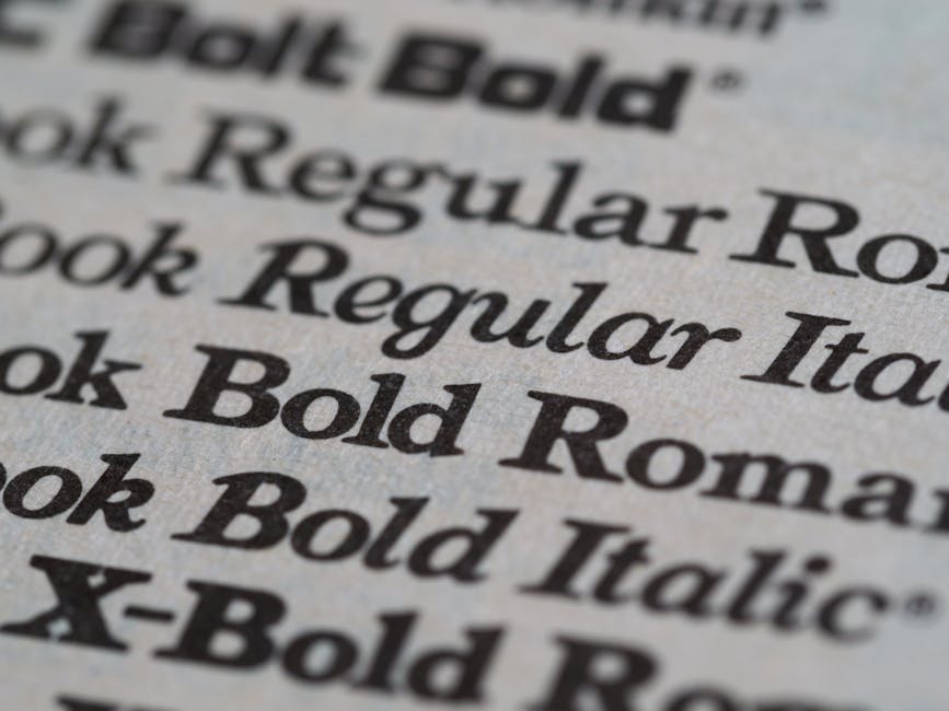
Your fancy script font is killing your watch time. Almost 80% of social media users scroll on mute, and bad subtitle typography slashes viewer comprehension by 30%. When I edit long-form interviews and vertical clips in Adobe Premiere Pro every single day, I don't touch decorative cursive or thin serifs.
I stick to high-contrast sans-serif fonts that stay razor-sharp on a cracked smartphone screen at 2 AM. Picking the best sans serif fonts for high-contrast video captions isn't a branding exercise. It's a mathematical retention decision.
If a viewer has to pause or squint for even a fraction of a second to decipher a word, they swipe away. In this guide, I'll break down the top typefaces, outline contrast formulas, safe zone rules, and show you how to automate the entire caption styling process in Premiere Pro without rendering previews over and over.
Key Takeaways
- Videos with clear captions generate up to an 80% higher completion rate on silent mobile feeds.
- Geometric sans-serif typefaces like Montserrat and Poppins provide the large x-heights required for instant legibility on 9:16 mobile displays.
- Combining bold white text with a 2px to 4px black stroke or a semi-transparent dark background box guarantees maximum contrast across changing footage.
- Avoid ultra-heavy weights like Arial Black for multi-line sentences, as tight internal letter counters clutter small displays.
- Restrict short-form vertical captions to 2 to 5 words per onscreen beat within the lower-middle safe zone.
- Tools like KreateFlo's CaptionFlow streamline subtitle creation in Premiere Pro with 22 animated presets and instant WASM previews, replacing hours of manual Essential Graphics work.
The Retention Math Behind Subtitle Legibility
When you post a video to TikTok, Instagram Reels, or YouTube Shorts, you're competing against thousands of fast thumbs. Most editors treat captions like an afterthought. They just pick whatever default font their NLE throws at them.
That's a massive mistake.
Subtitles aren't decorative elements. They're the main voice of your video when the sound is off.
Why Silent Feed Scrolling Dictates Typography
Data shows that 69% of viewers watch videos on mute in public [1]. Meanwhile, 50% watch with the sound off even in private settings [1]. If your audio is muted and your text is hard to read, your video effectively doesn't exist.
A survey on digital viewing habits confirmed that 50% of Americans use subtitles most of the time online [3]. That number jumps dramatically among younger audiences. In fact, 80% of viewers aged 18 to 25 watch with subtitles [3].
So if your captions smear across a bright background or blend into a host's white shirt, those viewers scroll immediately.
80% Public Mute:69|Private Mute:50:Muted Mobile Viewing Scenarios %
Pro Tip: Choose a semi-bold or bold font weight over light or ultra-thin variants. Thin strokes completely vanish when exported at lower bitrates or viewed on mobile screens outdoors in direct sunlight.
Actionable Takeaway: Audit your current caption workflow by viewing exported clips on a physical mobile device at 50% screen brightness to verify letterform clarity over moving backgrounds.
7 Best Sans Serif Fonts for High-Contrast Video Captions
Not all sans-serif fonts are created equal. Some work brilliantly for long-form documentary subtitles, while others shine in fast-paced vertical clips.
Here are the seven best sans serif fonts for high-contrast video captions that consistently perform on screen.
| Font Name | Category | Primary Use Case | Standout Feature |
|---|---|---|---|
| Montserrat | Geometric Sans | TikTok, Reels, Shorts | Extra-large x-height with wide structural proportions |
| Poppins | Geometric Sans | Modern Podcasts & Tech | Perfectly circular curves for modern digital displays |
| Roboto | Neo-Grotesk | YouTube Long-Form | Dual-nature geometric and mechanical open structure |
| Open Sans | Humanist Sans | Educational & Documentaries | Highly neutral letterforms with wide character spacing |
| Futura Condensed | Geometric Condensed | Multi-Line & Lower-Thirds | Narrow footprint fits long sentences in tight safe zones |
| Tiresias | Accessibility Sans | Broadcast & Accessible Video | Designed for vision-impaired viewers with distinct character shapes |
| Helvetica Neue | Neo-Grotesk | Master Subtitles & Film | Neutral design that avoids drawing attention away from video |
Montserrat and Poppins: Geometric Champions for Short-Form
Montserrat Bold has become the undisputed king of short-form video captions [3], [5]. Its geometric roots give it wide, stable letterforms that command attention on mobile screens [5].
Because lowercase letters are nearly as tall as capital letters, Montserrat remains legible even at rapid word-by-word pacing [3].
Poppins is another geometric favorite that brings a
Both fonts absorb dark strokes and drop shadows exceptionally well. They're my top picks when setting up templates for vertical edits.
Roboto and Open Sans: Workhorse Typefaces for Long-Form
If you're subtitling a 45-minute podcast episode or a long-form YouTube tutorial, heavy geometric fonts can feel overwhelming over long stretches. That's where Roboto Medium shines as YouTube's default caption font [4].
Developed by Google for
Open Sans offers a slightly warmer humanist feel with open apertures and generous character tracking [7].
Studies show that 76% of creative professionals prioritize legibility and accessibility [7] when picking on-screen type. Open Sans consistently ranks among the top choices for neutral, easy-to-read text [7].
Futura Condensed and Tiresias: Specialized Solutions for Tight Spaces
Sometimes you need to fit a long sentence across a narrow horizontal space without shrinking your font size into unreadable territory. Futura Bold Condensed lets you maintain high visual impact while squeezing up to 30% more text per line [7].
On the accessibility side, Tiresias was specifically engineered for vision-impaired audiences [4] and adopted as the broadcast standard by the BBC [4].
Its distinct character tails—like the curved foot on the lowercase "l" and dot separation on the "i"—prevent letter confusion for viewers with visual impairments [4].
Pro Tip: Stick to a maximum of two font families across your entire channel brand. Use weight variations (e.g., Montserrat Bold for key emphasis vs Montserrat Medium for standard dialogue) rather than introducing a third font.
Actionable Takeaway: Download Montserrat Bold and Roboto Medium to build a versatile caption toolkit that covers both fast short-form reels and long-form interview edits.
High-Contrast Styling Rules: Strokes, Shadows, and Highlights

Selecting one of the best sans serif fonts for high-contrast video captions is only half the battle. If your text color matches the shirt of the person on camera, your font choice won't save you.
You need explicit contrast boundaries.
The White Text and Black Outline Formula
The gold standard for video captioning across film, television, and social media is simple: pure white text paired with a thin dark outline [5], [6]. This combination builds a permanent visual barrier between letterforms and background footage [6].
Contrast Formula = Pure White Fill (#FFFFFF) + 2px-4px Dark Outline (#000000)
When lighting shifts from a dark interior shot to a blown-out sunny window, white text with a dark stroke remains readable [6].
Alternatively, placing text over a semi-transparent black background box (set to 50% or 70% opacity) provides a fail-safe surface [7]. This is especially helpful during high-motion sequence cuts [7].
Box Formula = Text Fill (#FFFFFF) + Background Box (#000000 at 60% Opacity)
Word-by-Word Color Highlighting for Cadence
For fast vertical videos, static text blocks fail to hold viewer interest. Modern editing workflows rely on active word highlighting—changing the color of the spoken word in real-time as the talent speaks.
Bright yellow (#FFD700) or neon green (#39FF14) highlights draw the viewer's eye straight to the active narrative beat.
This technique creates a natural rhythmic anchor, forcing silent scrollers to read along with the audio pacing.
Active Highlight = Main Text (#FFFFFF) -> Spoken Word (#FFD700) + 3px Stroke (#000000)
Pro Tip: Never use bright neon text without a dark stroke or box shadow. Green or yellow text directly over bright camera footage creates severe visual vibration that repels viewers.
Actionable Takeaway: Apply a 3px black stroke to all white caption text by default in your NLE style templates to guarantee contrast across every lighting condition.
Avoiding Common Subtitle Typography Pitfalls on Mobile
Over the years, I've seen plenty of editors ruin great cuts with terrible caption choices. Fixing these basic mistakes will immediately elevate your production quality.
The Arial Black Clutter Problem
Many editors reach for ultra-heavy font weights like Arial Black or Impact. They think bigger and thicker always means better legibility.
That's a trap.
When you apply extreme font weights to multi-line captions, the internal spaces inside letters like "e", "a", and "o" collapse. On smaller phone displays, these collapsed counters fill in, turning words into blurry black blobs.
Stick to standard Bold or Extra-Bold weights from clean geometric families instead.
Script Fonts and Micro-Sizing Mistakes
Using decorative cursive, handwritten scripts, or thin serif fonts for captions is a fast way to tank retention. Thin strokes and ornate flourishes blur into background video [5] when compressed by mobile algorithms [5].
Another mistake is shrinking font size to fit long paragraphs on screen. If a sentence requires four lines of text, you're asking the viewer to read a book while watching a clip.
Keep captions concise by capping lines at 42 characters [10] or breaking dialogue into short 2-to-5-word pop-ups [7].
INCORRECT: 4 lines of 12pt cursive script floating over bright footage
CORRECT:   1 line of 36pt Montserrat Bold with black stroke in safe zone
"If the audience has to stop watching the speaker's face to decipher your caption font, your visual hierarchy is broken."
Pro Tip: Do not place captions near screen edges. Mobile app interfaces will cover your hard work with like buttons, account names, and video descriptions.
Actionable Takeaway: Replace any decorative or ultra-heavy serif fonts in your caption library with clean geometric sans-serifs that maintain open letter counters.
Formatting the Best Sans Serif Fonts for High-Contrast Video Captions in Premiere
If you edit in Adobe Premiere Pro daily like I do, you know the default subtitle workflow can feel painfully slow. Creating custom animated text word-by-word with standard Motion Graphics Templates (MOGRTs) often takes hours per project.
Traditional Essential Graphics Panel Workflow
The standard way to style captions in Premiere Pro involves manually transcribing audio, generating a subtitle track, upgrading captions to graphic layers, and customizing settings in the Essential Graphics panel.
While this gives you manual control over font selection, stroke width, and text placement, it comes with major bottlenecks:
- MOGRTs lag heavily on longer timelines with hundreds of cuts.
- Applying word-by-word highlight colors manually requires endless keyframing.
- Changing font choices across a full podcast edit forces tedious bulk adjustments.
- Rendering timeline previews to check simple style tweaks burns editing time.
Manual Premiere Workflow:
Transcribe -> Upgrade to Graphics -> Tweak Essential Graphics -> Keyframe Highlights -> Render Preview
(Estimated Time: 2 to 4 hours per 30-minute edit)
Speeding Up Subtitles with Animated Caption Presets
To bypass this headache, I use KreateFlo's CaptionFlow tool. KreateFlo is an Adobe Premiere Pro CEP extension (v1.0.3) that packs 33+ editing tools into a single panel inside your NLE.
Instead of spending hours manually aligning graphics, CaptionFlow offers 22 animated caption presets designed specifically for high retention. You can apply Montserrat, Poppins, or Roboto styles across your timeline in seconds.
Because KreateFlo runs on a custom WebAssembly (WASM) engine, you get real-time previews directly inside Premiere Pro without waiting for render bars. You tweak the font size, adjust stroke thickness, pick highlight colors, and see the exact output instantly.
CaptionFlow Workflow:
Select Preset -> Choose Sans-Serif Font -> Real-time WASM Preview -> Export
(Estimated Time: 90 seconds per 30-minute edit)
| Before | 90 seconds |
|---|---|
| After | 4 hours |
Let's talk about honest caveats. KreateFlo is a CEP plugin built exclusively for Adobe Premiere Pro. It is not a standalone web app, and it doesn't work in Final Cut Pro or DaVinci Resolve.
If you want an automated browser dashboard like Opus Clip or Descript, KreateFlo isn't for you. But if you live inside Premiere Pro and want to avoid per-hour billing extensions like FireCut—which get expensive fast—KreateFlo gives you a flat, predictable setup.
The Pro tier is $19.99/mo for 20 AI hours, and Studio is $44.99/mo for 50 AI hours. You can even test the waters with KreateFlo's free tier, which includes 3 tools forever (Silence Remover, Transition Assistant, and Copy & Paste).
Pro Tip: Save your favorite sans-serif font styling, stroke width, and highlight color settings as custom presets inside CaptionFlow to maintain absolute brand consistency across client projects.
Actionable Takeaway: Install KreateFlo's CaptionFlow extension in Premiere Pro to instantly generate high-contrast, animated captions with real-time WASM preview.
Respecting 9:16 Vertical Safe Zones and Platform UI Overlays
You can choose the best sans serif fonts for high-contrast video captions, but if TikTok's "Like" button sits on top of your text, your effort is wasted. You must keep text inside mobile safe zones.
TikTok and Instagram Reels UI Coverage
Mobile social platforms place heavy user interface elements over vertical 9:16 videos. Account handles, audio titles, captions, and action buttons cluster along the bottom and right edges, while status bars occupy the top.
+-----------------------------------+
|         TOP SAFE MARGIN           |  <- Avoid top 15% (Status bars)
|                                   |
|       PRIMARY CONTENT AREA        |
|                                   |
|      [ CAPTION SAFE ZONE ]        |  <- Lower-middle 60% zone
|                                   |
|        BOTTOM UI OVERLAY          |  <- Avoid bottom 20% (Handles/Buttons)
+-----------------------------------+
Keep your captions inside the central 60% of the screen. Specifically, position text roughly 20% to 35% up from the bottom edge.
This keeps captions clear of platform UI overlays on TikTok, Instagram Reels, and YouTube Shorts.
Positioning Captions for Optimal Eye Tracking
Human visual processing works best when text sits near the focal point of the video action. Placing captions in the lower-middle zone allows viewers to scan words while still taking in the speaker's facial expressions [7].
Keep word count per onscreen beat low.
Displaying 2 to 5 words at a time maintains fast visual cadence and prevents large text blocks from cluttering the frame [7].
[[STAT:42:maximum characters per line for readable video subtitles]]
Pro Tip: Turn on vertical safe margin guides inside Premiere Pro's Program Monitor when positioning caption blocks to avoid UI overlap before exporting.
Actionable Takeaway: Position all vertical short-form captions between 20% and 35% from the bottom of the 9:16 frame to prevent platform UI clipping.
Evaluating the Best Sans Serif Fonts for High-Contrast Video Captions Across Devices
Before delivering final cuts to clients or publishing to social channels, test how your typography renders across different screen types and hardware environments.
Desktop vs Mobile Testing Protocols
A caption setup that looks readable on a 27-inch 4K editing monitor can look tiny and unreadable on a budget mobile screen. Always test your exported files on actual mobile hardware before final delivery.
Testing Protocol Checklist:
1. Export a 15-second test clip containing bright and dark background scenes.
2. AirDrop or transfer the file to an iOS and Android smartphone.
3. Review footage at 100% brightness outdoors and 30% brightness indoors.
4. Verify stroke contrast, letter spacing, and active highlight color visibility.
Modern accessibility standards like the Accessible Perceptual Contrast Algorithm (APCA) evaluate lightness contrast [8] based on spatial characteristics like font weight and display size [8].
Unlike older WCAG 2.1 guidelines, APCA accounts for display polarity and modern screen technologies [9]. This makes it the ideal framework for testing dynamic video captions [8], [9].
"Testing your captions on your editing monitor isn't enough. If it doesn't pass the outdoor mobile screen test at 50% brightness, it fails."
Building a Consistent Channel Brand Identity
Consistency builds authority. When viewers scroll past your content, uniform subtitle typography instantly identifies your brand.
Pick one primary sans-serif font family (such as Montserrat or Poppins) and stick with it across all short-form content. Use subtle color accents or stroke adjustments to differentiate show segments or guest speakers, but keep the underlying typography uniform.
Pro Tip: If you edit multi-speaker podcasts, assign unique active highlight colors to each guest (e.g., yellow for the host, cyan for the guest) while keeping the base font and outline identical.
Actionable Takeaway: Create a channel style sheet that defines your primary sans-serif font, stroke width, text color, and active highlight shade for every editor on your team.
Frequently Asked Questions
What is the best font for TikTok and Instagram Reels captions?
Montserrat Bold and Poppins Bold are currently the top choices for vertical short-form captions [3], [5]. Their geometric structure, wide proportions, and tall x-height make them exceptionally easy to read on mobile screens, even during fast-paced dialogue [3], [5].
How do you create high-contrast subtitles that are readable over moving video?
Combine bold white text with a 2px to 4px black stroke or place text over a semi-transparent black background box set to 50–70% opacity [6], [7]. This creates a clear visual boundary between the letters and shifting camera lighting [6].
What font does YouTube use for default video subtitles?
YouTube uses Roboto Medium as its default closed caption typeface [4]. Google designed Roboto specifically for high legibility across varied display resolutions, balancing geometric shapes with open curves [4].
What are the caption safe zones for 9:16 vertical videos?
The safe zone for vertical 9:16 video lives in the central 60% of the screen. Avoid the top 15% (where platform headers sit) and bottom 20% (where user handles, captions, and action buttons overlay the video).
Why should you avoid serif and script fonts for video captions?
Thin serif strokes and decorative script flourishes blur when compressed for mobile video playback [5]. They blend into moving video backgrounds, increasing visual effort, reducing viewer comprehension by up to 30%, and lowering overall retention [1], [5].
Stop Wasting Time on Manual Subtitle Styling
Subtitling your videos doesn't have to mean choosing between ugly default captions and spending four hours keyframing graphics layers in Premiere Pro. By sticking to clean, geometric sans-serif typefaces like Montserrat, Poppins, or Roboto—and backing them up with solid contrast outlines—you keep silent scrollers glued to your feed.
If you edit long-form interviews, podcasts, or vertical clips in Adobe Premiere Pro and want to automate this entire process, check out KreateFlo. You get 22 animated caption presets, instant WASM previews, AI multi-cam editing, and silence removal built right into your NLE panel.
Ready to cut your caption editing time from hours to seconds? Download KreateFlo for Premiere Pro and start styling high-contrast captions today.
References
- accessibilitychecker.org/blog/apca-advanced-perceptual-contrast-algorithm/
- techloy.com/10-best-fonts-for-subtitles-and-captions-top-picks-in-2025/
- flixier.com/blog/best-fonts-for-subtitles
- veed.io/learn/best-font-for-subtitles
- amberscript.com/en/blog/best-font-subtitles/
- recapo.ai/blog/best-caption-styles-for-shorts/
- mykaraoke.video/blog/good-subtitle-font
- git.apcacontrast.com/documentation/APCAeasyIntro.html
- myndex.github.io/TuttleAndButtle/
- partnerhelp.netflixstudios.com/hc/en-us/articles/235511047-Greek-Timed-Text-Style-Guide
- clevercast.com/bbc-subtitling-guidelines/
- limegreen.media/best-fonts-for-subtitles/
- pptmaker.co.in/blog/top-fonts-professional-slides
- transcript.lol/blog/best-font-for-subtitles
- webyes.com/blogs/best-ada-compliant-fonts/
- gotranscript.com/en/blog/subtitle-font-10-best-fonts
- broadcastwriter.com/2024/12/12/bbc-subtitle-style-guide-2024/
- circletranslations.com/blog/subtitle-fonts-top-10-fonts-for-subtitles-and-closed-captions
- rendercut.io/best-fonts-for-video-captions-on-mobile
- transkriptor.com/best-font-for-subtitles/
- creativebloq.com/design/fonts-typography/accessible-subtitle-fonts
Try KreateFlo free
3 tools forever, 7-day trial on the rest. No credit card to start.
Download KreateFlo