Fonts for Captions: 2026 Guide to Condensed vs Rounded
Choosing Between Condensed Fonts and Rounded Fonts for Captions: Essential Guide I spent three years putting standard sans-serif fonts on every Adobe Premiere Pro sequence, completely blind to why my
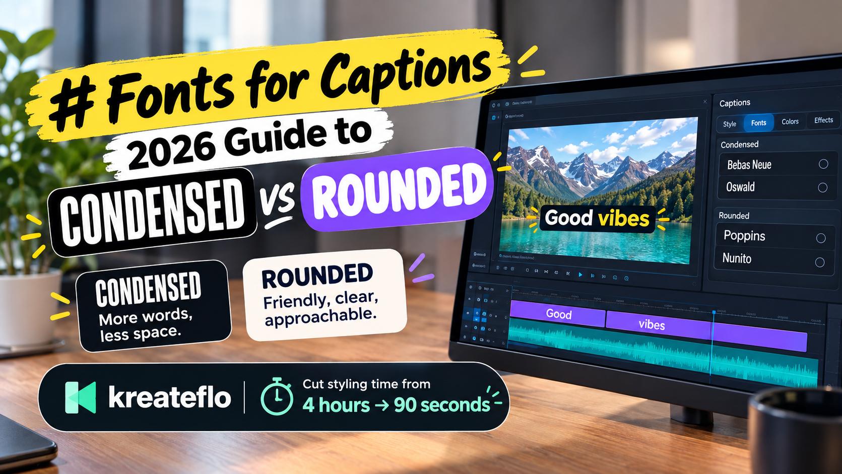
I spent three years putting standard sans-serif fonts on every Adobe Premiere Pro sequence, completely blind to why my 9:16 retention graphs kept dropping off at second four. Choosing between condensed fonts and rounded fonts for captions isn't an aesthetic preference. It's a brutal calculation balancing reading speed against vertical screen real estate.
When you edit long-form podcasts or high-energy short clips in Premiere Pro, captions aren't a mere accessibility setting. They serve as the primary graphic interface for mobile scrollers watching videos on mute in daylight. Picking a tall, narrow display typeface versus a wide, friendly geometric font changes how quickly a viewer processes your narrative hook.
Key Takeaways
- Condensed fonts like Bebas Neue and Oswald maximize word count in tight 9:16 frame margins for short, punchy 1-to-3 word bursts.
- Rounded geometric fonts like Poppins and Nunito create a warm, approachable tone ideal for educational, lifestyle, and vlog content.
- Target a 48px to 70px font size on 1080x1920 frames to keep captions readable without blocking core video visuals.
- Always apply a dark stroke outline or semi-transparent background pill so captions stand out against bright footage.
- Stick to one primary font family per channel and vary font weight or highlight color for emphasis.
- Position text in the lower-middle safe zone to avoid overlapping TikTok, Instagram Reels, and YouTube Shorts UI icons.
- Automate caption generation using Premiere Pro extensions like KreateFlo CaptionFlow to cut styling time from 4 hours down to 90 seconds.
Choosing Between Condensed Fonts and Rounded Fonts for Captions: The Retention Impact
If you monitor retention graphs in YouTube Studio or TikTok Analytics, you know the first three seconds dictate your video's fate. Over 80% of short-form mobile video is consumed on mute in public spaces. Captioned short-form videos achieve 17% to 32% higher watch times compared to uncaptioned clips [1].
+------------------------------------------------------------------+
|                  MOBILE FEED RETENTION DYNAMICS                  |
|                                                                  |
|   Muted Mobile Feed Viewers:  80%+ Total Mobile Traffic          |
|   Watch Time Uplift with Subtitles:  +17% to +32% Retention       |
|                                                                  |
|   [Condensed Display Fonts]  ---> High-Speed Hook Recognition     |
|   [Rounded Geometric Fonts]  ---> Warmth, Intimacy & Trust      |
+------------------------------------------------------------------+
When viewers scroll through vertical feeds, their eyes perform rapid fixations on on-screen text. Typeface width and terminal style dictate how fast the human brain processes active word highlights. So, choosing between condensed fonts and rounded fonts for captions directly dictates cognitive load and processing speed.
[[STAT:32%:watch time increase with captions]]
Muted Mobile Consumption and Eye Tracking
Eye-tracking research reveals that viewers scan mobile captions in glanceable micro-bursts rather than reading full sentences smoothly [8]. When audio is muted, the brain relies entirely on visual text cues to establish context. If your font is delicate or poorly spaced, cognitive friction spikes and viewers swipe away immediately.
Here is the reality: character structure affects visual recognition speed during rapid on-screen movement [8]. Studies on font glanceability prove that tight, tall letterforms pull the eye inward [8]. Conversely, wide, rounded letterforms force horizontal eye tracking across the mobile screen [1].
Word-by-Word Karaoke Highlights vs Multi-Line Blocks
Modern short-form video editing relies heavily on word-by-word active karaoke highlighting, where each spoken word lights up in a contrasting accent color as the speaker talks. This editing style works best when captions occupy a single line or a tight centered block.
Psychological research indicates that visual contrast treatments trigger immediate attention in high-distraction environments [9]. Condensed fonts let you fit larger point sizes within single-line animated karaoke blocks. Rounded fonts work better when presenting two-line phrases, as open counters reduce visual fatigue during longer explanations [1].
Pro Tip: Use word-by-word karaoke highlighting for videos with fast pacing (over 160 words per minute). For slower, conversational interviews, stick to two-line caption phrases so the text display matches natural speech cadence.
Actionable Takeaway: Audit your video retention graphs and switch to single-line word-by-word captions if viewer drop-off spikes in the first five seconds of muted playback.
When to Pick Heavy Condensed Fonts for High-Energy Videos
Heavy condensed display typefaces act like billboard headlines on a mobile screen. They pack maximum visual density into narrow vertical margins. This makes them ideal for high-energy content that demands immediate viewer attention.
+------------------------------------------------------------------+
|                   CONDENSED FONT DISPLAY PROFILE                 |
|                                                                  |
|   CHARACTERISTICS: Narrow width, high x-height, rigid stems      |
|   BEST USE CASE: 1-to-3 word screen bursts, sports, finance      |
|   POPULAR TYPEFACES: Bebas Neue, Oswald, Anton                   |
|   STRENGTH: Maximizes font size in vertical 9:16 boundaries     |
+------------------------------------------------------------------+
When you edit talking-head videos in Adobe Premiere Pro, condensed fonts let you push character height up to 70px on a standard 1080x1920 canvas. And you can do that without cutting off text at the edges of the frame [4].
Bebas Neue, Oswald, and Anton for Punchy Hooks
Typefaces like Bebas Neue, Oswald, and Anton feature flat vertical stems and tight character spacing [2]. This structural design creates an aggressive, authoritative visual presence on screen [9].
Condensed display typography excels in narrow 9:16 vertical canvases because its compact footprint allows for larger point sizes within tight line boundaries [2], [7]. Sports clips, fitness motivation, crypto commentary, and aggressive sales pitches rely on these heavy condensed styles to mirror spoken intensity [3].
| Before | 3 words |
|---|---|
| After | 12 words |
Avoiding Character Cramping in Long Phrases
The biggest mistake editors make with condensed fonts is applying them to multi-line paragraphs. When condensed text spans three or four lines, character cramping occurs [2].
The tight tracking that makes a three-word hook pop turns a full sentence into an unreadable visual blur [2].
| Font Family | Style Category | Best Screen Burst Length | Mobile Legibility Score | Recommended Niche |
|---|---|---|---|---|
| Bebas Neue | Heavy Condensed | 1–3 Words | High (Short Hooks) | Sports, Fitness, Sales |
| Oswald | Semi-Condensed | 2–4 Words | Very High | Business, Tech News |
| Anton | Extra Condensed | 1–2 Words | High (Punchy Accents) | Viral Clips, Hype Edits |
| Poppins | Rounded Geometric | 4–7 Words | Excellent | Education, Vlogs, Podcasts |
| Nunito | Soft Rounded | 4–8 Words | Excellent | Lifestyle, Wellness, Storytelling |
When using condensed typefaces, restrict on-screen display to 1 to 3 words per line [2]. If your speaker utters a complex 12-word sentence, split the phrase into consecutive pop-up bursts. Don't force all twelve words onto the screen at once [2].
Actionable Takeaway: Restrict condensed fonts like Bebas Neue or Anton to 1-to-3 word active bursts to avoid letter cramping and maintain fast reading speeds on mobile devices.
When Rounded Geometric Fonts Deliver Better Engagement

While condensed fonts excel at loud hooks, rounded geometric fonts build trust, warmth, and long-term viewer engagement. These typefaces feature rounded stroke terminals and circular geometric proportions that reduce visual tension [1], [9].
+------------------------------------------------------------------+
|                   ROUNDED FONT DISPLAY PROFILE                   |
|                                                                  |
|   CHARACTERISTICS: Soft terminals, high x-height, open counters   |
|   BEST USE CASE: Long-form podcasts, education, vlogs, tech       |
|   POPULAR TYPEFACES: Poppins, Nunito, Baloo                      |
|   STRENGTH: Prevents visual fatigue, easy long-phrase reading    |
+------------------------------------------------------------------+
If your video content focuses on educational tutorials, agency case studies, or conversational podcasts, rounded fonts keep viewers watching. They convey information smoothly without making the audience feel shouted at by on-screen graphics [3], [6].
Poppins and Nunito for Approachable Storytelling
Poppins, designed by Jonny Pinhorn and Ninad Kale in 2014, remains a staple choice for modern digital media [1]. Its high x-height and open letter counters preserve clarity on compact mobile screens [1].
Rounded font terminals soften visual tone to create an approachable narrative feel that builds viewer rapport [1], [6]. Nunito offers similar benefits, using rounded curves that soften technical jargon and complex explanations [3].
Maintaining Legibility Across Small Screen Sizes
Rounded geometric typefaces maintain structural clarity across a wide range of mobile display resolutions [10]. Data visualization readability studies show that uniform stroke widths prevent character blur on lower-end screens [10].
  CONDENSED TYPE PROFILE          ROUNDED GEOMETRIC PROFILE
  +-----------------------+       +-----------------------+
  |  I  N  T  E  N  S  E  |       |  A p p r o a c h      |
  |  T  A  L  L           |       |  F r i e n d l y      |
  +-----------------------+       +-----------------------+
   Tight Tracking (1-3 Wds)        Open Counters (4-8 Wds)
Because rounded letters feature wider proportions, they require slightly lower point sizes (48px to 60px) compared to condensed alternatives [4]. However, their open letterforms mean viewers can comfortably read multi-line captions without slowing down their reading speed [1].
Pro Tip: When editing multi-speaker podcast interviews, assign a rounded font like Poppins Bold to the host and a distinct accent weight or color to the guest to keep speaker distinction clear.
Actionable Takeaway: Choose rounded geometric fonts like Poppins or Nunito when editing educational or conversational videos to build trust and reduce eye fatigue.
Choosing Between Condensed Fonts and Rounded Fonts for Captions in 9:16 Vertical Feeds
Deciding between condensed fonts and rounded fonts comes down to matching typeface psychology with your channel's visual identity and content genre.
+------------------------------------------------------------------+
|                   CHANNEL NICHE & FONT SELECTION                 |
|                                                                  |
|   [Sports / Gym / Hype Clips]     ---> Heavy Condensed (Bebas)   |
|   [Tech / Business / Finance]     ---> Semi-Condensed (Oswald)   |
|   [Educational / Agency / SaaS]   ---> Geometric Bold (Poppins)  |
|   [Vlog / Lifestyle / Wellness]   ---> Soft Rounded (Nunito)     |
+------------------------------------------------------------------+
Matching Typography to Your Channel's Niche
Selecting the right font family requires aligning visual tone with your audience's expectations [2], [9].
- Hype Edits, Gym Content, Sports: Use heavy condensed fonts like Anton or Bebas Neue to deliver maximum visual punch [2], [3].
- Business, Finance, Tech News: Use structured semi-condensed fonts like Oswald to balance authority with readable text density [2], [5].
- Educational, SaaS, Agency Tutorials: Use clean geometric sans-serif fonts like Montserrat or Poppins to convey clarity and professional authority [1], [6].
- Lifestyle, Vlogs, Personal Storytelling: Use soft rounded fonts like Nunito or Baloo to maintain a casual, personal aesthetic [3].
Consider this case study: a 17-second
Mixing Fonts vs Sticking to One Brand Family
A common mistake among video editors is changing font families mid-video [2]. Switching from Bebas Neue on the hook to Poppins on the main body copy causes visual clutter and breaks audience retention [2].
Instead, stick to one primary font family per video series. Create contrast by varying font weights—like switching from Regular 400 to ExtraBold 800—or applying dynamic word highlighting [4].
Actionable Takeaway: Pick one font family for your channel's short-form brand kit and rely on weight changes and accent color highlights for visual emphasis rather than switching typefaces mid-video.
Contrast Layers, Font Sizes, and Safe Zones for Mobile Captions
Even the best font will fail to convert viewers if it lacks separation from background video footage or gets covered by social media interface overlays.
+------------------------------------------------------------------+
|                  9:16 VERTICAL FRAME SAFE ZONES                  |
|                                                                  |
|   +----------------------------------------------------------+   |
|   | [Top Bar: Account Search & Filter Overlays] - UNSAFE     |   |
|   |----------------------------------------------------------|   |
|   |                                                          |   |
|   |               OPTIMAL CAPTION PLACEMENT                  |   |
|   |              Vertical Center (40% - 65%)                 |   |
|   |                                                          |   |
|   |----------------------------------------------------------|   |
|   | [Bottom Bar: Captions, Music Track, Like Button] UNSAFE  |   |
|   +----------------------------------------------------------+   |
+------------------------------------------------------------------+
Size Guidelines: 48px–70px Range on 1080x1920 Frames
For 9:16 portrait video reels (1080x1920 resolution), set caption text sizes between 48px and 70px [3], [4]. Anything smaller than 48px becomes illegible on small mobile screens held at arm's length [4].
For standard 16:9 landscape videos (1920x1080 resolution), target a lower range of 42px to 55px. Landscape viewports cover proportionally less vertical screen height [4].
Strokes, Shadows, and Background Pills for Contrast
Video footage changes brightness frame by frame. To keep text legible against unpredictable footage, add dedicated contrast layers [4]:
      LIGHT BACKGROUND                     DARK BACKGROUND
  +-----------------------+            +-----------------------+
  | [DARK STROKE OUTLINE] |            | [WHITE TEXT / SHADOW] |
  |   OR BACKGROUND PILL  |            |   OR ACCENT HIGHLIGHT |
  +-----------------------+            +-----------------------+
- Stroke Outlines: Apply a dark stroke (3px to 6px width) in black or dark gray to separate bright text from bright background elements [4].
- Drop Shadows: Use a sharp 80% opacity drop shadow with 0px distance and low blur to pop text off complex footage without creating visual muddying [4].
- Background Pills: Place semi-transparent black or dark-colored background boxes behind text for full legibility over moving or chaotic video backgrounds [2], [4].
- Font Weight Minimums: Never use font weights lighter than Regular (400). Default to Bold (700) or Heavy (900) so letter strokes remain solid across compressed mobile video feeds [4].
Avoiding TikTok and Instagram Reels UI Clipping
Social media platforms place native icons, audio titles, account names, and engagement buttons around the edges of vertical video screens [2], [4].
Placing captions too low in vertical frames causes native platform UI elements on TikTok and Instagram Reels to block on-screen text [2], [4]. Position your captions in the middle-lower vertical region—between 40% and 65% up from the bottom of the frame—to keep your text readable and unobstructed [4].
Pro Tip: In Premiere Pro, create a visual overlay mask representing TikTok and Instagram Reels UI overlays and toggle it on while editing to make sure your captions never get clipped by platform controls.
Actionable Takeaway: Position vertical video captions between 40% and 65% up from the bottom of the 1080x1920 frame, and apply a 4px dark stroke outline to maintain high visual contrast.
How to Automate Caption Styling in Adobe Premiere Pro
Selecting the right typography is only half the battle. If you edit client podcasts or high-volume short-form content daily, manually styling caption tracks in Adobe Premiere Pro eats up huge chunks of editing time.
+------------------------------------------------------------------+
|                   CAPTION WORKFLOW TIME COMPARISON               |
|                                                                  |
|   Manual MOGRT & Essential Graphics Workflow:  ~4 Hours/Episode   |
|   KreateFlo CaptionFlow Plugin Workflow:        ~90 Seconds       |
|                                                                  |
|   Time Saved Per Project:                       3.8+ Hours       |
+------------------------------------------------------------------+
| Before | 90 seconds |
|---|---|
| After | 4 hours |
Why Manual Caption Styling Burns 4 Hours per Episode
Creating animated captions manually in Premiere Pro using native text layers or Motion Graphics Templates (MOGRTs) is painful. You transcribe audio, break text blocks into individual lines, adjust timing frame by frame, apply font properties, and animate active word highlights. On a 45-minute multi-speaker podcast turned into ten short reels, this manual process easily burns 4 hours per project.
Standalone web-based platforms try to solve this, but force you into tedious round-trip export workflows. They force you to render video outside Premiere Pro, breaking your color pipeline and clip metadata. Meanwhile, plugins with per-hour AI pricing models like FireCut get ridiculously expensive as your client volume scales up.
Styling Animated Presets in KreateFlo's CaptionFlow
KreateFlo solves this inside your primary editing timeline. KreateFlo v1.0.3 is a native Adobe Premiere Pro extension (CEP extension) that bundles 33+ tools into a single panel, eliminating the need to leave your NLE.
Using KreateFlo CaptionFlow, you automate transcription and styling in seconds:
- Open the KreateFlo CEP panel in Adobe Premiere Pro and select your sequence track.
- Choose your language from over 40 supported options—including Bangla, Hindi, English, Spanish, and French.
- Pick one of 22 animated caption presets, including active word karaoke pop-up, background pill styles, and bold display text.
- Preview typography styling in real time using built-in WASM rendering without waiting for slow render-to-see-changes loops.
- Click apply to generate styled Essential Graphics caption blocks directly on your timeline in 90 seconds instead of spending 4 hours keyframing manually.
Unlike per-hour billing extensions, KreateFlo offers a straightforward pricing structure: a Free tier with 3 tools forever (Silence Remover, Transition Assistant, and Copy & Paste), a Pro tier at $19.99/month offering 20 AI processing hours, and a Studio tier at $44.99/month providing 50 AI processing hours.
Actionable Takeaway: Replace manual MOGRT keyframing with CaptionFlow inside Adobe Premiere Pro to test condensed and rounded caption presets with instant WASM previews in 90 seconds.
Choosing Between Condensed Fonts and Rounded Fonts for Captions: Final Workflow Checklist

To streamline your caption workflow and improve viewer retention on mobile feeds, follow this structured font selection decision tree before rendering your final timeline export.
+------------------------------------------------------------------+
|                  TYPOGRAPHY DECISION FLOWCHART                   |
|                                                                  |
|   Is your video high-energy, fast-paced (1-3 word bursts)?        |
|     |---> YES: Choose Heavy Condensed (Bebas Neue / Oswald)      |
|     |---> NO:  Is it educational, conversational, or a vlog?     |
|                  |---> YES: Choose Rounded (Poppins / Nunito)    |
|                  |---> NO:  Choose Clean Sans-Serif (Montserrat) |
+------------------------------------------------------------------+
The Step-by-Step Font Selection Decision Tree
- Identify Video Tone: Match heavy condensed fonts (Bebas Neue, Oswald) to high-energy hooks and sports clips. Assign rounded geometric fonts (Poppins, Nunito) to podcasts, vlogs, and educational content.
- Verify Frame Size: Set vertical 9:16 captions to 48px–70px font sizes. Set landscape 16:9 text to 42px–55px font sizes.
- Check Legibility Minimums: Set font weights to Regular (400) minimum, defaulting to Bold (700) or Heavy (900). Never use thin font weights over moving video.
- Apply Contrast Protection: Add a dark 4px stroke outline or semi-transparent background pill to keep captions legible over light background footage.
- Verify Safe Zone Alignment: Keep text centered between 40% and 65% up from the frame bottom to avoid TikTok and Instagram Reels UI elements.
When KreateFlo Is (and Isn't) the Right Tool
Let's be completely honest about software selection:
- When KreateFlo IS the right pick: If you edit multi-speaker podcasts, client interviews, YouTube Shorts, or agency reels daily inside Adobe Premiere Pro, KreateFlo is built for you. Combining automated silence cutting, multi-cam switching (up to 8 speakers and 8 cameras), and CaptionFlow into a single $19.99/mo extension saves hours per project.
- When KreateFlo IS NOT the right pick: If you only edit 16:9 cinematic feature films, narrative documentaries, or commercial color grades that only require basic static SRT subtitles, you don't need animated caption plugins. Premiere Pro's built-in Essential Graphics panel handles simple static SRT subtitles fine without extra plugins.
Frequently Asked Questions
Are condensed fonts better than rounded fonts for vertical video captions?
Condensed fonts work better for high-energy videos with short 1-to-3 word phrase bursts. Their narrow structure allows for larger text sizes in vertical 9:16 frames [2], [4]. Rounded fonts perform better for lifestyle, educational, and conversational videos where an approachable tone improves long-term viewer retention [1], [6].
What is the best font size range for Instagram Reels and TikTok captions?
For standard 1080x1920 vertical frames, set your caption font size between 48px and 70px [3], [4]. On landscape 16:9 videos, target 42px to 55px so text remains easy to read without obscuring central visual details [4].
Why do high-energy hype videos use condensed all-caps fonts like Bebas Neue?
Condensed all-caps fonts create an authoritative appearance that mimics billboard headlines [2], [9]. Their tall, narrow metrics fill the screen horizontally while maintaining high visual impact, stopping scrollers on mobile feeds [2], [7].
How do rounded fonts like Poppins affect viewer perception and video retention?
Rounded font terminals reduce visual tension, making technical or educational information feel casual and easy to digest [1], [9]. Poppins features a large x-height that preserves legibility on small mobile displays down to 18px render sizes [1].
What contrast treatments prevent captions from disappearing against bright video backgrounds?
Apply a secondary contrast layer such as a 3px to 6px dark stroke outline, a subtle drop shadow, or a semi-transparent black background pill behind your text [4]. Never use font weights lighter than Regular (400), and default to Bold (700) or Heavy (900) for fast-moving footage [4].
Font selection isn't just an aesthetic choice. It's a retention strategy for mobile screens. Use heavy condensed fonts when you need maximum impact in narrow vertical frames, and switch to rounded geometric fonts when building trust and warmth.
Once you pick your typeface, stop spending hours styling subtitle blocks manually on your timeline. Download KreateFlo for Adobe Premiere Pro to test 22 animated caption presets with instant WASM previews, auto-remove silences, and cut your short-form editing time from hours down to minutes.
References
- readabilitymatters.org/articles/fonts-of-wider-letter-shapes-improve-letter-recognition
- domestika.org/en/blog/14873-how-to-choose-a-font-for-a-project
- designyourway.net/blog/best-fonts-for-tiktok/
- recapo.ai/blog/best-caption-styles-for-shorts/
- blitzcutai.com/blog/best-caption-fonts-tiktok
- emax.studio/blog/best-caption-fonts-for-ai-reels-2026
- bureaubrut.com/family/round-condensed
- nngroup.com/articles/glanceable-fonts/
- shakuro.com/blog/font-psychology-tricks-to-enhance-your-ux
- nightingaledvs.com/choosing-fonts-for-your-data-visualization/
- brandguides.brandfolder.com/gp2025/typography
- dool.agency/insights/the-psychology-of-font-choices-in-branding
- brandologist.com.au/insight/font-psychology-the-small-details-that-make-big-differences
- visla.us/blog/how-tos/vislas-subtitle-style-library/
- todaymade.com/blog/font-psychology
- vistaprint.com/hub/font-trends
- kittl.com/blogs/top-font-trends-dsi/
- inspoai.io/blogs/typography-trends-2026
Try KreateFlo free
3 tools forever, 7-day trial on the rest. No credit card to start.
Download KreateFlo