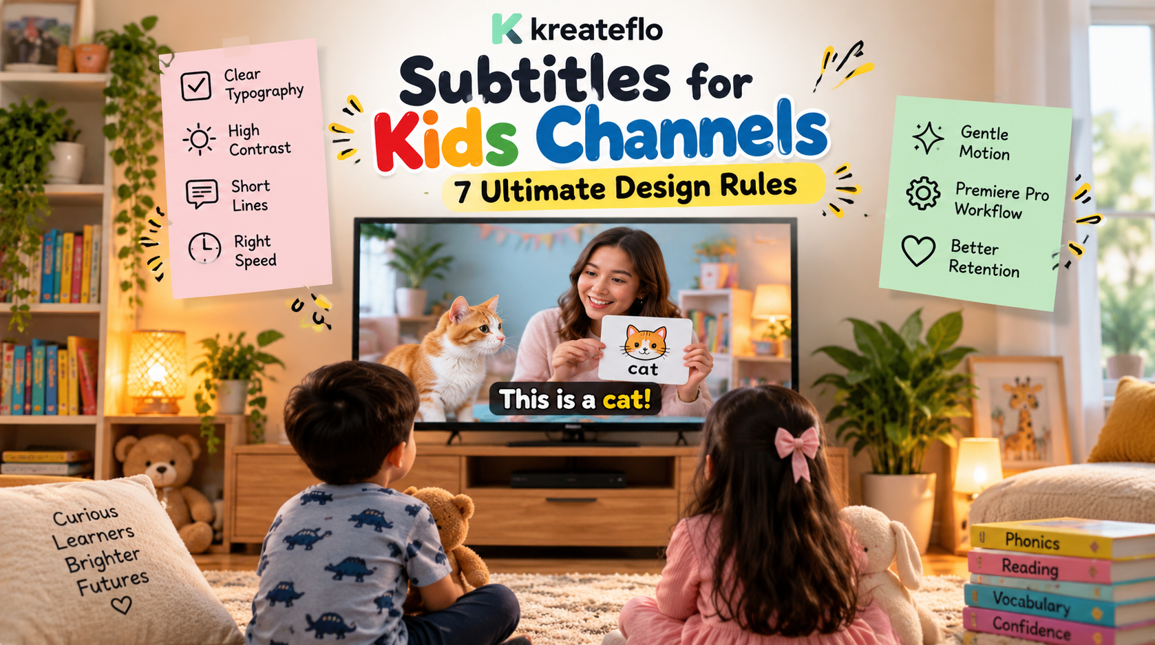
Subtitles for Kids Channels: 7 Ultimate Design Rules
Most video editors treat subtitles like an afterthought, slapping rapid kinetic text over the screen and calling it done. Do that on a children's video and your retention graph will drop off a cliff.
Most video editors treat subtitles like an afterthought, slapping rapid kinetic text over the screen and calling it done. Do that on a children's video and your retention graph will drop off a cliff.
Turning on captions for kids does not increase video completion rates by up to 40% [5] by accident—it helps young viewers read as many words in a year as Harry Potter, Narnia, and Lord of the Rings combined. But burning neon cursive over busy animated footage turns early readers off in seconds [4], [7].
Here is how I build colorful, highly readable captions inside Adobe Premiere Pro in 90 seconds instead of wasting four hours keyframing graphics layers by hand.
Key Takeaways
- Subtitles turn passive screen time into reading practice, helping children digest millions of written words annually [3].
- Stick to rounded sans-serif or comic-style display fonts like Open Sans, Montserrat, or Bangers instead of cursive scripts [7], [9].
- Achieve a 21:1 contrast ratio by pairing crisp white text with dark 3-4px stroke outlines or semi-transparent backings [5], [8].
- Cap line lengths at 30 characters and never display more than two text rows at once [1], [4].
- Extend dwell times for children to at least 2.3 seconds per 30-character phrase based on a 13 characters-per-second baseline [4].
- Keep text motion restrained—use gentle phrase bounces or pops rather than chaotic fly-ins [4], [10].
- Automate timeline transcription and caption styling in Premiere Pro using native tools or CEP extensions with real-time preview engines.
Why Subtitles for Kids Channels Require a Specialized Design Strategy
Standard adult caption rules fall apart the moment you edit for children. Adults follow kinetic text that flips across the screen at 200 words per minute [5]. Kids simply cannot process that speed [4].
Young eyes struggle with dense line layouts and rapid scene cuts [4], [6]. Placing low-contrast text over bright cartoon animation makes the problem worse [4].
Here's the reality: designing subtitles for kids requires treating text as both a visual graphic and an educational guide [3], [10]. If your captions move too fast, children lose the narrative arc and bounce off the video [3], [4]. But if they are too slow, kids get bored.
The Educational Impact: Turning Screen Time into Literacy
Henry Warren, cofounder of the Turn on the Subtitles (TOTS) campaign, established that enabling captions on kids' media turns screen time into literacy practice. Children naturally track on-screen text while listening to the voiceover [3]. This dual sensory input speeds up word recognition, phonics comprehension, and sentence structuring [3].
According to federal captioning standards for synchronized media [1], captions must remain synchronized with speech so children associate written letterforms with spoken sounds. Maintaining a controlled reading pace directly supports developing minds [3], [4]. So when you structure captions for early readers, you transform entertainment into a functional learning environment [3].
The Retention Angle: Keeping Silent Viewers and Parents Engaged
Algorithm recommendations on YouTube, TikTok, and Instagram Reels rely on audience retention [6]. According to data on video caption engagement and placement [5], up to 85% of social media videos are watched with the sound muted. Parents frequently stream videos on tablets in quiet environments, restaurants, or doctor's waiting rooms where loud audio is impossible [5], [9].
Clear subtitles keep those silent viewers tuned in [5], [9]. When a child can follow along quietly, parents let the playlist run longer [5].
The result? Well-designed subtitles boost overall video completion rates by up to 40% [5]. That extra watch time signals the algorithm to push your content higher in search and recommendations [6].
Actionable Takeaway: Build every kids' video timeline assuming half your audience is watching on mute with a parent sitting nearby.
How to Design Playful and Readable Subtitles for Kids Channels: 4 Golden Rules
Designing titles for children requires strict visual boundaries so developing brains process text without strain [4], [10]. Strict visual constraints actually make your graphics look cleaner [8], [10].
Here are the four core structural rules I follow on every children's edit.
+-------------------------------------------------------+
|                 UPPER visual ACTION                   |
|                                                       |
|                                                       |
|                  SAFE ZONE BOUNDARY                   |
|  +-------------------------------------------------+  |
|  | [Rule 1] Max 30 Characters Per Line             |  |
|  | [Rule 2] Max 2 Lines of Text                    |  |
|  +-------------------------------------------------+  |
|  [Rule 3] Bottom 25% Screen Area (Clear of UI)     |
+-------------------------------------------------------+
Rule 1: Keep Characters per Line Under 30
Adult captions span 42 to 45 characters per line [1], [5]. For an early reader, that line length is overwhelming [4]. Their eyes wander across the frame, leading to tracking errors where they skip lines or lose their place [3], [4].
According to international legibility standards for video text [4], line lengths for children's media should never exceed 30 characters including spaces. Short lines keep the reader's eye centered on the frame [4], [6]. This allows children to grasp complete word blocks in a single glance rather than scanning back and forth [3], [4].
Rule 2: Never Exceed Two Lines of Text
Dumping three or four lines of text onto the screen creates immediate cognitive overload [1], [4]. Multi-line blocks cover action, block character expressions, and clutter the frame [4], [10].
Cap your subtitles at two lines maximum [1], [2]. Single-line captions work best for fast-paced short-form clips [6]. Two-line blocks are ideal for narrative voiceovers [1], [4]. According to guidelines for functional closed captions [2], restricting text to one or two lines maintains
Rule 3: Enforce Safe Zone Boundaries for Mobile Viewports
Mobile apps place interface buttons, comment icons, and channel logos over the bottom and right edges of vertical video [6], [8]. Place text too close to the screen border and platform overlays will cover your words [8], [10].
According to best practices for digital caption placement [10], subtitles should remain inside the lower-third safe zone. Position them in the bottom 25% of the frame while maintaining a 5% to 10% safety margin from the outer edge [10]. This prevents YouTube Shorts or TikTok UI elements from clipping your titles [6], [10].
Rule 4: Maintain Frame Gap Separations Between Cues
When one subtitle cue immediately replaces another without a visual pause, the reader's brain fails to register the change [4]. The words bleed together on screen, causing instant confusion [4].
According to video legibility design rules [4], you must leave a visual break of at least 1 frame between consecutive subtitle cues. That brief gap signals to the child's brain that a new thought has started [4]. It gives their eyes a micro-rest between sentences [4].
Actionable Takeaway: Set your caption tool limit to 30 characters, lock layout to 2 lines max, and enforce a 2-frame gap between subtitle blocks on your timeline.
Typography and Contrast Standards for Developing Readers
Font choice and color contrast decide whether a child reads your subtitle or skips past your video [7], [9]. Broadcasters have tested typography extensively to find what works best for early readers [7], [8].
| Font Name | Category | Best Use Case | Legibility Rating |
|---|---|---|---|
| Open Sans | Sans-Serif | General educational videos, multi-line captions | 9.5 / 10 |
| Montserrat | Geometric Sans | Modern short-form clips, bold titles | 9.0 / 10 |
| Bangers | Display / Comic | High-energy entertainment, punchy single words | 8.5 / 10 |
| Arial / Helvetica | Classic Sans | Standard broadcast captions, universal playback | 9.0 / 10 |
| Comic Sans MS | Rounded Informal | Informal early-reader content, beginner phonics | 8.0 / 10 |
Selecting Kid-Friendly Fonts That Maintain High Clarity
Never use thin serif typefaces or decorative script fonts for children's subtitles [7], [9]. Cursive loops and light strokes disappear completely when compressed on mobile screens [7], [8].
According to font selection guides for accessible captions [7], rounded sans-serif typefaces like Open Sans or comic display fonts like Bangers provide superior legibility for kids. Sans-serif letters feature clean, open counters and uniform stroke weights that prevent letterforms from blurring [7], [9]. Bolder font weights ensure letters remain sharp over high-motion animation [6], [8].
Pro Tip: Choose Montserrat ExtraBold or Open Sans Bold, then add a slightly rounded corner radius in your graphics panel. You get a fun aesthetic without sacrificing readability.
Achieving Maximum Contrast Over Busy Animated Backgrounds
Children's cartoons use bright yellows, saturated pinks, and intense blues. Placing plain white text directly over colorful footage makes the words disappear whenever the background shifts brightness [6], [8].
POOR CONTRAST (Text disappears):
Yellow Text  --->  [ Bright Animated Sky / Cartoon Scene ]

OPTIMAL CONTRAST (21:1 Ratio):
White Text + 4px Black Stroke + Dark Soft Box  --->  [ Any Busy Background ]
According to short video subtitle design standards [6], high-contrast white text paired with a solid dark stroke prevents text from washing out. According to technical specifications for caption contrast [5], pure white text placed over a dark background container delivers a 21:1 contrast ratio—the highest possible score for visual clarity.
When you want to avoid a solid background box, apply a dark 3px to 4px stroke outline around the letters [6], [8]. According to subtitle styling best practices [8], a 4px dark stroke isolates letterforms from busy artwork, ensuring visibility across light and dark scenes.
Actionable Takeaway: Pick a bold sans-serif font like Open Sans or Montserrat, set text color to solid white, and apply a 4px black stroke outline to guarantee contrast.
Dwell Times and Pacing: Balancing Reading Speed with Video Flow

Pacing is where most editors mess up. Sync kids' captions using adult reading speeds and young viewers miss half your message [3], [4].
ADULT PACING:
[ 17-20 Characters / Sec ]  --->  Fast, compact, minimal dwell time

KIDS PACING (13 CPS Target):
[ 13 Characters / Sec ]     --->  2.3 Seconds Minimum for a 30-Character Line
Calculating Reading Speeds for Children (13 Characters per Second)
Adult short-form captions move at 17 to 20 characters per second (CPS) [3]. For children, you need to slow that reading rate down considerably [4].
According to character-per-second subtitle research [3], optimal subtitle speeds for developing readers sit around 12 to 13 CPS. According to video legibility standards [4], a standard 30-character text line requires a minimum dwell time of 2.3 seconds on screen. This duration gives young readers enough time to process letterforms, comprehend words, and look back up at the animation [3], [4].
Adjusting On-Screen Duration for Multi-Line Captions
When displaying a two-line caption block containing 50 total characters, do not let it flash off screen after a single second [1], [4].
Calculate your on-screen duration by dividing total character count by 13 [4]. A 50-character cue requires roughly 3.8 seconds of display time [4]. So if the speaker finishes talking quickly, let the subtitle linger on screen for a few extra frames to hit that minimum dwell threshold [1], [4].
Minimum Display Duration Formula:
Display Duration (seconds) = Total Characters (including spaces) / 13
Example: 30 Characters / 13 = 2.3 Seconds Minimum
Actionable Takeaway: Configure your caption tool's reading speed setting to 13 CPS so every text block lingers long enough for early readers.
Step-by-Step Workflow: How to Design Playful and Readable Subtitles for Kids Channels in Premiere Pro
Manually creating graphic text boxes, typing out words, and keyframing motion in Adobe Premiere Pro takes forever. A typical 10-minute kids' video can consume up to 4 hours of manual subtitle editing. Using dedicated Premiere Pro plugins cuts that time down to roughly 90 seconds.
Here is how I build colorful, kid-friendly captions directly on my Premiere timeline.
+------------------------------------------------------------------------+
|                      ADOBE PREMIERE PRO TIMELINE                       |
+------------------------------------------------------------------------+
| [A1] Audio Track: Voiceover / Dialogue                                 |
|                                                                        |
| [KreateFlo Extension Panel]                                             |
|  1. Select Track A1 -> Generate Transcript (40+ Languages)             |
|  2. Open CaptionFlow Tool -> Pick Preset ("Creator Outline" / "Bounce")|
|  3. Real-Time WASM Preview -> Adjust Font, Stroke (4px), Scale (120%)  |
|  4. Click Apply -> Subtitles Burn directly to Essential Graphics Track |
|                                                                        |
| [V2] Subtitle Graphics Track: [Block 1] [Block 2] [Block 3] ...        |
| [V1] Video Track: Animated Footage                                     |
+------------------------------------------------------------------------+
Generating Transcripts from Audio Across 40+ Languages
First, import your final voiceover mix into your Adobe Premiere Pro sequence. Premiere offers built-in speech-to-text transcription, but CEP extensions like KreateFlo handle multi-speaker detection and filler-word removal in a single pass inside the editor panel.
Select your voice track and generate an automatic transcript. The underlying transcription engine supports over 40 languages—including Bangla and Hindi—making it straightforward to localize content for global audiences.
Applying Animated Presets via Real-Time WASM Preview Engines
Once your transcript is generated, you need to style the captions. Instead of manually tweaking Essential Graphics settings frame by frame, use integrated plugin tools.
Inside KreateFlo, I open the /features/captionflow.html tool. It features 22 animated caption presets designed for short-form clips and kids' videos. Because CaptionFlow uses a WASM real-time preview engine, you can test different font sizes, animations, and color schemes instantly on screen without waiting for render loops.
Fine-Tuning Color, Stroke, and Scale in Premiere Pro
In your plugin panel, select your target design parameters:
- Font: Choose Montserrat ExtraBold or Open Sans [7].
- Text Size: Set font scale relative to your frame height (roughly 5% to 8% of frame height) [8].
- Color & Stroke: Select solid white text, add a dark 4px outline stroke, or enable a semi-transparent black background box [6], [8].
- Line Rules: Set max characters per line to 30 and cap line count to 2 [1], [4].
Click apply. The plugin generates native Premiere Pro graphic clips on your timeline, letting you make manual text edits whenever necessary.
Pro Tip: Save your finalized font, color, and stroke settings as a custom style preset inside Premiere Pro. You can apply identical subtitle branding across an entire series with a single click.
Actionable Takeaway: Use dedicated timeline plugins with WASM preview engines to auto-generate styled, timed graphic clips in under two minutes.
Adding Subtle Motion Without Distracting Young Audiences

Motion makes subtitles feel alive, but wild kinetic animation ruins readability [4], [10]. When learning how to design playful and readable subtitles for kids channels, moderation is your best friend [4], [6].
RECOMMENDED: Subtle Phrase Pop / Gentle Scale Bounce
[ Word ]  --->  Scale 100% -> 105% -> 100% (Guides focus smoothly)

AVOID: Erratic Kinetic Motion
[ Word ]  --->  Rotate 360° + Fast Slide In + Flash (Causes visual fatigue)
Choosing Word-by-Word Pops vs. Phrase Bounces
Two primary animation styles work best for children's content:
- Word-by-Word Pops: Individual words scale up slightly (e.g., 100% to 108%) as spoken [6]. This subtle motion guides the reader's eye to the active word without shifting text positions [6], [10].
- Phrase Bounces: The entire two-line subtitle block slides up 10 pixels with a soft ease-out effect when a new phrase starts [8], [10]. This provides clear visual feedback that a new sentence has begun [4], [10].
According to video text animation guidelines [4], subtitle motion should remain discreet and consistent throughout the entire video. Switching animation styles every few seconds confuses young readers [4], [6].
Avoiding Excessive Kinetic Effects That Impair Visual Tracking
Avoid erratic kinetic typography [1], [4]. Do not use 3D text rotations, fast screen-wide slides, aggressive shaking, or flashing neon colors [4], [6].
According to accessibility guidelines for media titling [1], flashing effects and rapid kinetic movements distract from visual content and can trigger eye strain. Keep your motion smooth, subtle, and predictable [4], [10].
Actionable Takeaway: Select a single gentle pop or bounce animation and lock it across your entire video project.
4 Common Captioning Pitfalls That Kill Viewer Retention on Kids Channels
Even experienced editors fall into simple titling traps when switching from adult edits to children's content [7], [10]. Avoid these four common mistakes to keep retention high.
COMMON MISTAKES TO AVOID:
1. Fancy Script / Cursive Fonts  ---> Hard for kids to decode letterforms
2. Low-Contrast Colors           ---> Yellow/green text washes out over bright cartoons
3. Fast Dwell Times              ---> Forcing 17+ CPS deprives kids of reading time
4. Covering Character Faces      ---> Text placed in upper visual area blocks action
Mistake 1: Relying on Fancy Script Fonts
Ornate cursive fonts look great in wedding videos, but they ruin children's captions [7]. Early readers learn block lettering and simple sans-serif shapes first [7], [9]. Introduce complex decorative loops, and children spend extra cognitive energy trying to decipher individual letters instead of understanding the sentence [3], [7].
According to closed caption font guides [9], simple, clean fonts like Verdana or Open Sans outperform decorative typefaces in legibility and comprehension every time.
Mistake 2: Using Low-Contrast Yellow or Green Pairings
Pure yellow text without an outline looks bright on a dark background, but it disappears instantly over sunny outdoor cartoon scenes or white animated backgrounds [6]. Green text suffers from the same problem against grass or forest artwork [6].
According to short video subtitle design rules [6], avoid plain yellow or green text unless you place it inside a dark background container or outline it with a heavy dark stroke.
Mistake 3: Cutting Off Dwell Time for Fast Voiceovers
Fast voiceovers present a real challenge [1]. If a narrator speaks at 200 words per minute, cutting captions to match speech duration forces text off screen too quickly [1], [4].
According to caption timing standards [1], when voiceover speed exceeds normal reading rates, editors must edit down filler words in the transcript or extend subtitle dwell times beyond the voice duration [1], [4]. Displaying a concise summary of the sentence for 2.5 seconds works far better than flashing a word-for-word transcript that disappears in 0.8 seconds [1], [4].
Mistake 4: Positioning Captions Over Character Faces
Placing subtitles in the middle of the frame covers character faces, expressions, and key animated action [2], [10]. Kids watch cartoons for visual storytelling; blocking character reactions ruins the experience [2].
According to best practices for closed caption placement [10], keep captions positioned inside the lower-third safe zone. Shift text to the upper third only when important lower-third graphics or on-screen labels appear [1], [10].
Actionable Takeaway: Audit your sequence for illegible script fonts, low-contrast colors, rushed dwell times, and visual obstructions before exporting your final edit.
Streamlining Your Subtitle Workflow in Adobe Premiere Pro
Editing podcasts, educational shows, or children's content daily requires balancing speed with quality [5], [6]. Choosing the right tools determines whether you spend your evenings manual-keyframing titles or shipping finished videos on schedule.
Manual Captions vs. Native Speech-to-Text vs. Dedicated Extensions
You have three main options for building captions inside Premiere Pro:
- Manual Titling: Creating Essential Graphics layers by hand. This offers total design control but takes roughly 3 to 4 hours per 10-minute video project.
- Native Speech-to-Text: Premiere Pro's built-in caption track auto-transcribes dialogue fast. But converting caption tracks into fully animated Essential Graphics layers with real-time previewing requires tedious extra manual steps.
- Dedicated CEP Extensions (e.g., KreateFlo): Extensions run directly inside Premiere Pro as panel plugins. They auto-transcribe audio, filter out filler words, and apply animated graphic presets with real-time WASM previews in about 90 seconds.
| Workflow Method | Setup Time | Animation Flexibility | Real-Time Preview Engine | Typical Cost |
|---|---|---|---|---|
| Manual Essential Graphics | 3 to 4 Hours | Unlimited (Manual) | No (Requires timeline playback) | Included with Premiere |
| Native Speech-to-Text | 15 to 30 Mins | Basic Captions | No | Included with Premiere |
| KreateFlo Plugin (v1.0.3) | ~90 Seconds | 22 Animated Presets | Yes (Instant WASM engine) | Free tier / $19.99/mo Pro |
| FireCut Plugin | ~2 to 5 Mins | Preset Animations | Limited | Per-hour AI billing |
When to Use KreateFlo (and When You Shouldn't)
Let's be completely transparent: KreateFlo is not always the right tool for every project.
If you only edit quick 15-second mobile clips on your phone, standalone apps like CapCut work fine. If you edit single-camera talking-head videos once a month, Premiere's native built-in speech-to-text tools are more than enough.
But if you run a content agency, produce multi-speaker podcasts, or manage high-volume YouTube kids channels inside Adobe Premiere Pro, dedicated extensions save dozens of editing hours every week.
Instead of paying per-hour AI billing fees like FireCut, KreateFlo Pro costs $19.99/mo for 20 AI hours (or Studio at $44.99/mo for 50 AI hours), bundling 33+ tools into one panel extension. The free tier gives you 3 core tools forever (Silence Remover, Transition Assistant, Copy & Paste). You get animated captions, silence removal, auto-reframing, filler word removal, and multi-cam editing for up to 8 speakers directly on your timeline.
For more details on optimizing long-form timeline workflows, check out our guide on how to streamline multi-cam podcast editing in Premiere Pro.
Actionable Takeaway: Pick toolsets that match your project scale—use native tools for simple occasional edits, and leverage integrated extensions when managing high-volume client channels.
Master Your Subtitle Workflow in Premiere Pro
Learning how to design playful and readable subtitles for kids channels is not about piling on aggressive text animations. It comes down to striking the right balance between clean branding and clear legibility [4], [10].
By choosing clean typography [7], enforcing high contrast ratios [5], and giving early readers generous dwell times [4], you transform basic captions into an engine for retention and early literacy [3], [5].
Stop spending four hours keyframing text boxes by hand. Download KreateFlo at /download.html to test our free tier tools today and build clean animated captions on your Premiere Pro timeline in seconds.
Frequently Asked Questions
What are the best fonts for children's video subtitles on YouTube?
The best fonts for kids' subtitles are clean sans-serif typefaces like Open Sans and Montserrat, or friendly comic display fonts like Bangers [7]. Avoid decorative script or cursive fonts because early readers struggle to decipher complex letterforms quickly on screen [7], [9].
How big should subtitle font size be for kids' channels?
Font size should take up roughly 5% to 8% of total frame height on mobile viewports [8]. Ensure text is clearly legible when viewing a phone at arm's length, restricting lines to a maximum of 30 characters [4], [6].
Do subtitles help children improve their reading and literacy skills?
Yes [3]. Research from the Turn on the Subtitles (TOTS) campaign shows that enabling captions turns video viewing into passive reading practice, helping children digest millions of additional words per year and significantly improving word recognition and phonics skills [3].
What color combination provides the highest contrast for video captions?
Pure white text paired with a black stroke outline or placed inside a semi-transparent black background box delivers a 21:1 contrast ratio [5], [8]. This combination guarantees maximum legibility across bright, colorful, or animated cartoon backgrounds [5], [6].
How long should captions stay on screen for young viewers?
Subtitles for children should remain on screen for at least 2.3 seconds per 30-character phrase, based on a reading rate of 13 characters per second [4]. Always include at least a 1-frame gap between consecutive subtitle cues to give young eyes a clear visual break [4].
References
- section508.gov/create/captions-transcripts/
- doit.uw.edu/knowledge-base/what-are-some-guidelines-for-creating-attractive-and-functional-open-or-closed-captions
- blog.amara.org/2024/10/17/crafting-accessible-subtitles-the-critical-role-of-characters-per-second-cps/
- legibility.info/rules-for-text-in-videos
- opus.pro/blog/video-caption-design-placement
- taption.com/blog/en/2025-short-video-subtitle-design-tips-en
- maestra.ai/blogs/5-best-subtitle-fonts-for-different-uses
- subtitlegenerator.app/guides/subtitle-design
- sonix.ai/resources/closed-captioning-font/
- accessibility.com/blog/best-practices-for-closed-captioning
- wavel.ai/blog/7-best-fonts-for-subtitles-and-captions-in-videos
- kidscreen.com/2024/08/12/cbc-research-finds-that-kids-like-all-kinds-of-captions/
- frutoconsultancy.com/blog/10-essential-tips-for-choosing-accessible-fonts-for-educational-digital-products
- rastlelab.com/post/mythbusting-claims-that-same-language-subtitles-improve-childrens-reading
- royalholloway.ac.uk/about-us/news/research-shows-using-subtitles-to-help-children-read-does-not-work-despite-worldwide-campaigns/
- noahtype.com/child-friendly-web-typography/
- behavioraltimes.com/turn-on-subtitles-for-kids/
- convertaudiototext.com/blog/subtitle-styling-best-practices
- vsubtitle.com/subtitle-font-size-and-reading-speed-2026/
- subtitling.net/standards/subtitle-reading-speed
- sublingo.cc/guides/subtitle-reading-speed
- cloudinary.com/guides/video-formats/what-are-video-subtitles-common-formats-and-best-practices
Try KreateFlo free
3 tools forever, 7-day trial on the rest. No credit card to start.
Download KreateFlo