Caption Style Guide: 5 Proven Steps for Agencies (2026)
How to Set Up a Video Agency Caption Style Guide: Essential SOP for Premiere Pro Editors Most agencies let freelancers pick whatever random TikTok font strikes their fancy on every render. Then client
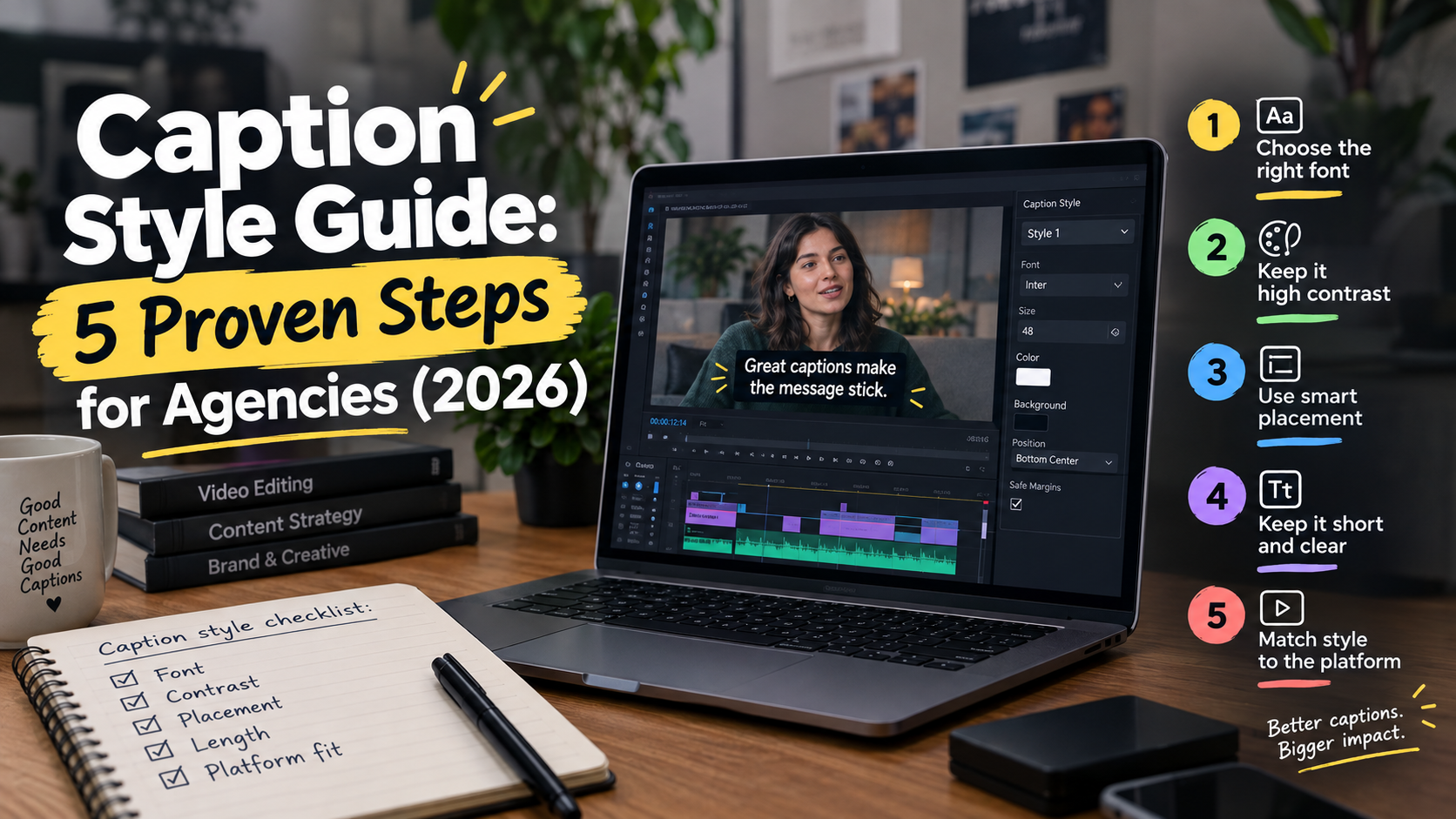
Most agencies let freelancers pick whatever random TikTok font strikes their fancy on every render. Then client revisions hit, and your junior editor spends four hours fixing off-screen text manually.
If 85% of Facebook video is watched on mute [4], shipping broken captions isn't just sloppy—it kills viewer retention instantly. Here is how we set up a rigid caption style guide in Adobe Premiere Pro so every editor on our team hits brand specs without burning out.
Key Takeaways
- Cap text at 32 characters per line for closed captions and up to 42–47 for open social captions.
- Maintain a reading speed of 120 to 160 words per minute so text does not overwhelm viewers.
- Never keep a caption on screen for less than 2 seconds or let speech exceed 180 WPM.
- Build platform-specific title safe overlays into Adobe Premiere Pro to avoid app UI elements.
- Ensure burned-in text maintains at least a 4.5:1 contrast ratio to meet WCAG standards.
- Use standard SRT sidecars or synchronized preset templates like KreateFlo CaptionFlow across remote editors.
Why Your Agency Needs a Standardized Caption Workflow in Adobe Premiere Pro
Let's be honest about how agency timelines collapse. You hire a talented contract editor to cut a ten-episode video podcast. They turn in episode one with bright yellow Montserrat text anchored to the bottom frame.
Then episode two comes back from a second freelancer using script fonts with drop shadows that bleed straight into the client's lower-third logo.
So you spend four hours in Adobe Premiere Pro fixing subtitle tracking, correcting line breaks, and re-rendering exports. That is unbillable time eating straight into your agency margin.
The Cost of Freelancer Inconsistency
When five editors use five different subtitle styles, your client's brand authority takes a hit. Clients rarely analyze kerning or contrast ratios. They just know the final export looks amateur.
"Establishing an explicit Standard Operating Procedure (SOP) inside your podcast editing workflow eliminates guesswork."
When every editor opens a Premiere timeline, they should apply a single pre-built agency style preset. That simple step cuts revision rounds from three down to zero.
85% viewed without sound
Client Retention and Mute-Viewing Realities
Subtitles are no longer an afterthought for hard-of-hearing compliance. Survey data reveals that 50% of Americans [6] watch video content with subtitles turned on most of the time.
On short-form social feeds, 95% of consumers watch short-form videos [10], and the vast majority scroll on mute while commuting or working.
If your text is cropped behind a TikTok comment button or hard to read over a white shirt, the viewer scrolls away in under two seconds. Setting up a standardized caption workflow ensures your hooks land every single time.
Pro Tip: Build a single project template in Premiere Pro containing your agency title-safe graphics and caption presets. Have every new freelancer duplicate that master file before cutting a single frame.
Actionable Takeaway: Audit your agency's last ten delivered videos and document every typography inconsistency across editors into a shared checklist.
Typography & Safe Zones for Social Captions
Typography forms the structural foundation of your agency caption style guide. If your font choice is hard to scan at 1.5x playback speed, your design fails regardless of how nice the colors look.
| Before | 4.5 to 1 |
|---|---|
| After | 21 to 1 |
Selecting Clean Sans-Serif Typefaces
Never allow decorative, handwritten, or thin serif fonts for body subtitles. Federal Section 508 captioning standards [1] mandate clear sans-serif typefaces to guarantee legibility across varied display sizes.
Standardize your team on time-tested fonts:
- Arial
- Helvetica
- Montserrat (Bold or ExtraBold weights)
- Open Sans
- Inter
Pair your chosen font with either a solid 2px to 4px dark stroke outline or a semi-transparent background box.
According to WCAG 2.1 color contrast criteria [5], white text over a solid black background box delivers a 21:1 contrast ratio. That far surpasses the mandatory 4.5:1 minimum threshold.
Mapping UI-Safe Zones for Social Platforms
Native mobile app interfaces are packed with visual noise. TikTok overlays username text, audio titles, and reaction buttons along the bottom and right edges of the screen.
Instagram Reels places like buttons and caption previews over the lower quarter of the video.
To prevent platform UI elements from overlapping your text, import transparent PNG safe-zone guides into your Premiere Pro sequence.
| Platform | Top Danger Zone | Bottom Danger Zone | Right Danger Zone | Safe Caption Box |
|---|---|---|---|---|
| TikTok (9:16) | Top 15% (Header/Search) | Bottom 20% (Caption/Sound) | Right 12% (Action Icons) | Center 68% Vertical |
| Instagram Reels | Top 10% (Top Bar) | Bottom 18% (Account Info) | Right 10% (Icons) | Center 72% Vertical |
| YouTube Shorts | Top 8% (Search/Camera) | Bottom 15% (Title/Channel) | Right 10% (Subscribe) | Center 77% Vertical |
| Horizontal (16:9) | Top 5% (Title Bar) | Bottom 8% (Player Controls) | None | Lower Third Above Controls |
Following visual safe-zone design benchmarks [7] keeps your text completely visible across every platform without needing individual edits per export.
Pro Tip: Enable Title Safe margins inside your Premiere Pro Program Monitor (View > Button Editor > Safe Margins) and adjust the percentage offsets to match 9:16 mobile UI zones.
Actionable Takeaway: Create a permanent 1080x1920 timeline sequence preset in Premiere Pro with locked guide layers for TikTok and Instagram Reels UI elements.
Styling Short-Form Captions That Retain Viewers

Short-form edits require a completely different visual hierarchy than long-form interviews. When editing 30-second clips, your job is guiding the viewer's eye to key emphasis points before they scroll.
+-------------------------------------------------------+
|  [Standard Closed Caption - 16:9 Long-Form]           |
|  "Welcome back to the podcast. Today we are talking"  |
|  (Bottom Center, 32 Chars/Line, Static White Text)    |
+-------------------------------------------------------+
                           vs
+-------------------------------------------------------+
|  [Kinetic Open Caption - 9:16 Short-Form Clip]        |
|                  "WE ARE TALKING"                     |
|  (Middle Center, 15 Chars/Line, Highlighted Word)     |
+-------------------------------------------------------+
Kinetic Word Highlights for TikTok and Reels
Dynamic captioning highlights individual spoken words in real time using high-visibility accent colors like neon yellow (#FFF500) or electric cyan (#00F0FF).
According to short-form video analytics [10], adding visual text highlights during the first 3 seconds of a clip significantly increases completion rates.
But over-animating text creates visual confusion. So keep your base text white or light gray, and restrict color highlights strictly to key verbs or nouns.
Automating Animation Presets with CaptionFlow
Creating single-word kinetic text highlights manually in Premiere Pro takes hours of keyframing text layer opacity and color properties.
That is why we built CaptionFlow inside our Adobe Premiere Pro CEP extension, KreateFlo.
CaptionFlow includes 22 animated caption presets engineered specifically for social editors. Because it utilizes WebAssembly (WASM) for real-time previews right in your panel, you bypass the annoying render-to-see-changes loop.
"You can highlight active spoken words, apply bouncy pop-in transitions, and adjust line breaks across a 60-second clip in under 90 seconds."
If you are already using our viral clip finder to isolate top podcast moments, running those clips through CaptionFlow lets you ship ten fully styled short-form edits in under fifteen minutes.
Pro Tip: Instruct editors to stick to a maximum of two visual highlight colors per video project—one primary brand color for standard emphasis, and one secondary accent color for strong emotional hooks.
Actionable Takeaway: Limit kinetic word-level animation to 1–2 key emphasis words per clause to preserve
Technical Rules: Character Limits, Pacing, and Screen Timing
Bad subtitle timing ruins the viewing experience even if your font choice is spot on. If text pops up before a speaker utters a word or lingers long after they stop talking, the viewer's brain feels the disconnect immediately.
Standardizing Line Lengths and Line Counts
Never allow captions to stretch endlessly across the screen. Establishing rigid character limits ensures viewers scan text without losing their place in the video:
- Closed Captions (16:9 Broadcast/Web): Limit text to 32 characters per line [3]. Max 2 lines per caption block [9].
- Open Subtitles (9:16 Social Clips): Limit text to 15–22 characters per line. Max 2 lines (ideally 1 line for high-pacing edits) [2].
And always keep text blocks split by natural grammatical clauses rather than breaking nouns away from their adjectives.
Enforcing Readability Speed (WPM)
People speak faster than they read. Industry subtitling guidelines [8] target display speeds between 120 and 160 words per minute (WPM).
According to government accessibility specifications [1], speech exceeding 180 WPM (roughly 3 words per second) is too fast for comfortable reading.
[Audio Clip Duration: 1.2 Seconds]
Spoken Text: "And that is why the entire strategy failed completely."
Problem: 9 words in 1.2 seconds = 450 WPM (Unreadable)
Fix: Condense or split into two timed text blocks:
Block 1 (0.6s): "That is why the strategy..."
Block 2 (0.6s): "...failed completely."
Follow these strict duration rules in your style guide:
- Minimum On-Screen Time: No caption event should stay on screen for less than 2.0 seconds [9], unless it is a rapid single-word kinetic text pop.
- Audio Sync Frame Accuracy: Subtitle start and end points must align within 3 frames of audio onset [3].
- Silence Cut-offs: Remove text from the screen immediately when a pause in speech exceeds 0.8 seconds [1].
Pro Tip: Use KreateFlo's silence remover tool prior to generating transcriptions. Cutting dead air first aligns speech timing automatically, making caption block splitting far cleaner.
Actionable Takeaway: Hard-code a rule into your editor onboarding checklist: cap full-width subtitles at 42 characters per line and never let a block remain visible for under two seconds.
Managing Caption Style Guides Across Remote Teams
Managing a remote team of ten editors scattered across time zones requires bulletproof asset distribution. You cannot rely on vague Slack messages telling people to "use Montserrat Bold at size 42."
Building Shared Mogrt and Preset Files
Export your team's finalized Premiere Pro caption styles as .prfpset files or Motion Graphics Templates (.mogrt). Store these master assets in a shared team folder or Creative Cloud Library.
When onboarded, an editor imports your .prfpset into Premiere Pro's Text panel.
With one click, their transcription turns into your agency's exact font, tracking, stroke, shadow, and position specs.
+-----------------------------------------------------------------------+
|                       AGENCY CAPTION TOOL MATRIX                      |
+-------------------+---------------------+-----------------------------+
| Feature / Need    | KreateFlo v1.0.3    | FireCut / AutoPod / Others  |
+-------------------+---------------------+-----------------------------+
| Environment       | Premiere Pro Native | Premiere / External Web     |
| Pricing Model     | $19.99/mo (Pro)     | Per-hour credits or $30+/mo |
| WASM Live Preview | Included            | Render-to-preview loop      |
| Multi-Cam Engine  | Up to 8 Speakers    | Limited to 4-6 Speakers     |
| Free Tier         | 3 Tools Forever     | Limited Free Trial          |
+-------------------+---------------------+-----------------------------+
When KreateFlo Isn't the Right Pick
We built KreateFlo to streamline our own internal agency editing inside Premiere Pro. But trust matters more than hype, so let's be upfront about when our plugin is not the right choice for your team.
KreateFlo is strictly an Adobe Premiere Pro CEP extension. It is not a standalone desktop application, and it does not run inside a browser.
So if your agency edits exclusively in DaVinci Resolve or Final Cut Pro, KreateFlo will not work for you.
Similarly, if you prefer browser-based text editing where you cut video by deleting words in a web transcript—like Descript or Opus Clip—KreateFlo takes a different approach.
KreateFlo keeps you inside Premiere Pro's timeline. You maintain full control over your sequence cuts, multi-cam angles, and color grading without round-tripping files.
For Premiere editors, KreateFlo bundles 33+ tools into one extension. Our free tier includes 3 tools forever: Silence Remover, Transition Assistant, and Copy & Paste.
When you need AI capabilities, KreateFlo Pro costs $19.99/month for 20 AI hours, while Studio is $44.99/month for 50 AI hours.
Compare that $19.99/mo to FireCut's per-hour credit billing model or AutoPod's single-purpose multi-cam focus, and KreateFlo gives your remote editors a complete toolkit without inflating monthly software overhead.
And if you edit long-form video podcasts, our AI multi-cam editor cuts up to 8 speakers and 8 camera angles automatically (including a designated wide shot), saving hours of tedious timeline switching.
Pro Tip: Test new caption presets on both a dark scene and a bright scene before publishing them to your remote team's shared library.
Actionable Takeaway: Package your agency Mogrts, Premiere caption presets, and safe zone PNGs into a shared Cloud library and mandate its use in all freelancer contracts.
Speaker Identification and Non-Speech Audio Rules
When multiple people speak during an interview, readers easily lose track of who is talking. Your style guide must establish explicit standards for multi-speaker identification and ambient sound cues.
+--------------------------------------------------------------------+
|  [Correct Multi-Speaker Formatting]                                |
|  (SARAH) I think the entire Q3 launch was a massive success.       |
|  (MARK) Absolutely. We saw conversions jump by 40%.                |
|                                                                    |
|  [Correct Non-Speech Audio Cue Formatting]                         |
|  [dramatic music plays]                                            |
|  (SARAH) But then our primary server cluster went down.            |
+--------------------------------------------------------------------+
Standardizing Multi-Speaker Name Tags
When two speakers talk in quick succession, use distinct visual markers rather than random text styling:
- Name Prefixes: Place uppercase speaker names in parentheses at the start of a line:
(ALEX) Let's review the data.[2] - Speaker Color Coding: Assign subtle text color variations per speaker (e.g., Speaker 1 in pure white, Speaker 2 in light yellow). Avoid low-contrast shades like dark blue or gray [9].
- Dash Separation: For rapid back-and-forth dialogue within a single caption block, use hyphens:
- Are we ready?- Ready when you are.
Handling Sound Effects and Music Indicators
Captions must convey essential audio context for viewers watching without sound. Standardize non-speech audio cues using square brackets in lower-case or small-caps text [1]:
[applause][dramatic music plays][laughter][heavy sigh]
"Keep non-speech indicators brief. Never let sound descriptions displace active spoken dialogue on screen."
Pro Tip: If background music carries no narrative importance, leave the music indicator out. Only caption sound effects that add meaningful context to the video story.
Actionable Takeaway: Standardize speaker tags using upper-case names in parentheses and mandate square brackets for all contextual sound effects.
Accessibility Compliance and Deliverables
Delivering clean video files to clients means meeting professional accessibility criteria while supplying the exact file formats their social media managers require.
| 50|Mute Viewers | NaN |
|---|
WCAG 2.1 Color Contrast Requirements
Burned-in open captions must comply with Web Content Accessibility Guidelines (WCAG 2.1) [4]. Standard text requires a minimum contrast ratio of 4.5:1 against its background, while large text (18pt bold or higher) requires at least 3:1 [5].
If an editor places white text directly over a light background without a dark background box or stroke outline, your video fails accessibility compliance.
That opens your client up to potential legal issues on public web embeds.
+------------------------------------------------------------------+
|                  DELIVERABLE FILE MATRIX                         |
+-----------------------+---------------------+--------------------+
| Deliverable Type      | Format              | Best Used For      |
+-----------------------+---------------------+--------------------+
| Sidecar Subtitles     | .SRT File (UTF-8)   | YouTube, Web VOD   |
| Burned-In Captions    | MP4 Master (Open)   | Reels, TikTok      |
| Social Transcript     | Plain Text / .TXT   | Blog / Social Post |
+-----------------------+---------------------+--------------------+
Exporting Sidecar SRTs vs Burned-in Open Captions
Your style guide must specify deliverable formats based on target platforms:
- Sidecar .SRT Files: Deliver standalone
.srtfiles for YouTube, Vimeo, and website uploads. This allows platforms to index subtitle text for search SEO while letting viewers toggle closed captions on or off [6]. - Burned-in Open Captions: Export high-bitrate MP4s with burned-in subtitles for Instagram Reels, TikTok, YouTube Shorts, and LinkedIn feeds to guarantee exact typography rendering across mobile screens.
When transcribing multi-lingual podcasts, use KreateFlo's voice transcription tool to generate transcriptions across 40+ languages—including regional dialects like Bangla and Hindi—directly within Premiere Pro.
Pro Tip: Always export .srt sidecars using UTF-8 encoding. This prevents special characters, curly quotes, and accent marks from corrupting into weird symbol blocks on web video players.
Actionable Takeaway: Always export both a burned-in MP4 master and a standalone .SRT sidecar file for every client deliverable to cover social feeds and web SEO simultaneously.
Frequently Asked Questions
What font and size should be used in a video agency caption style guide?
Use clean sans-serif fonts such as Arial, Helvetica, Montserrat, or Open Sans set at a size that fills roughly 3% to 4% of your sequence's vertical screen height. Always pair your text with a 2px to 4px dark stroke outline or a semi-transparent black background box to ensure readability over bright or complex backgrounds.
How many characters per line should agency subtitles be limited to?
Standard closed captions on 16:9 widescreen videos should be capped at 32 characters per line with no more than two lines on screen at once. For short-form social media clips on TikTok or Instagram Reels, limit text to 15–22 characters per line so captions remain legible on small mobile displays.
What is the difference between open and closed caption style guidelines?
Closed captions (.SRT sidecar files) can be toggled on or off by the viewer and rely on the host platform's built-in text player. Open captions are burned directly into the video pixels during export, allowing video agencies complete control over custom typography, kinetic animations, colors, and title-safe positioning.
How do you handle caption placement when lower thirds are present on screen?
Specify in your agency SOP that captions must temporarily shift to the top-center or upper third of the frame whenever speaker names, lower-third graphics, or on-screen pop-up visuals appear along the bottom edge of the video. Never allow subtitle text to overlap lower thirds.
What contrast ratios are required for accessible video captions?
According to WCAG 2.1 Level AA standards, burned-in video captions require a minimum color contrast ratio of 4.5:1 against the background image. Placing solid white text over a black background box yields a 21:1 contrast ratio, providing maximum readability and full accessibility compliance.
Stop Wasting Hours on Subtitle Revisions
Setting up a strict caption style guide takes an hour of upfront planning, but it saves dozens of edit hours every single month across your team. Stop letting client revisions eat your margins over preventable font mistakes and misaligned text.
If you edit in Adobe Premiere Pro, test KreateFlo today. Our free tier gives you 3 essential editing tools forever with no credit card required.
When you are ready to automate your caption workflows, upgrade to Pro for $19.99/month to run CaptionFlow, fast AI multi-cam cuts, and instant transcription right inside your timeline workspace.
Download KreateFlo for Adobe Premiere Pro and streamline your agency editing workflow today.
References
- section508.gov/create/captions-transcripts/
- dcmp.org/learn/5-captioning-guidelines-for-the-dcmp
- fepss.org/subtitle-services/standard-subtitling-guidelines/
- accessibilitychecker.org/guides/wcag/
- 3playmedia.com/blog/closed-caption-styling-formatting-best-practices-you-need-to-know/
- videotap.com/blog/subtitle-formatting-best-practices-and-standards
- opus.pro/blog/video-caption-design-placement
- ptc.com/en/brand-guide/captions
- rev.com/blog/closed-captioning-guidelines-for-tv-movies-and-video-platforms
- birdeatsbug.com/blog/video-captioning-best-practices
- 1digitalagency.com/blog/a-guide-to-short-form-videos-for-marketing-that-actually-works/
- mediaalacarte.com/post/tips-for-short-form-video-content
- opus.pro/research/best-caption-strategy-short-form
- xr.global/press-releases/captions-are-no-longer-optional-u-s-audiences-now-expect-them-everywhere-they-watch-video
- sonix.ai/resources/subtitle-generation-trends/
- webability.io/blog/understanding-wcag-2-2-a-practical-guide
Try KreateFlo free
3 tools forever, 7-day trial on the rest. No credit card to start.
Download KreateFlo