Sentence Case vs All Caps Captions: Proven 2026 Guide
Sentence Case vs All Caps Captions: Which Reads Faster? Proven Guide If you're still setting entire multi-line captions in ALL CAPS inside Adobe Premiere Pro because you think it looks punchy, stop. Y
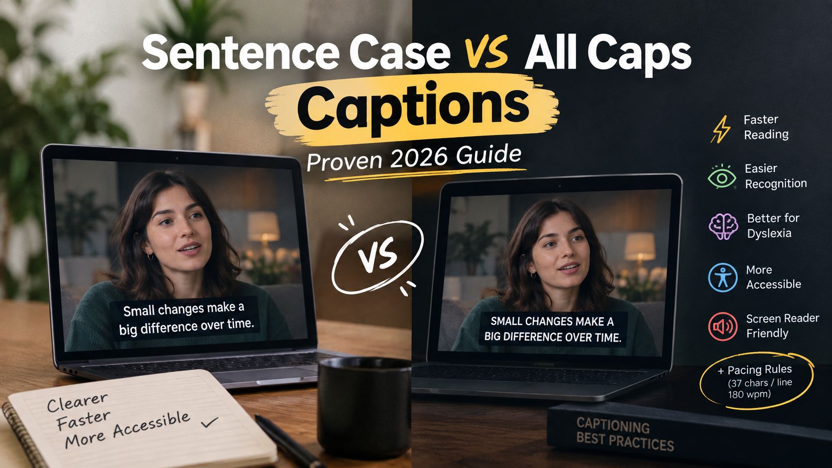
If you're still setting entire multi-line captions in ALL CAPS inside Adobe Premiere Pro because you think it looks punchy, stop. You're actively tanking your audience's reading speed by 10 to 20 percent [1]. Legacy TV decoders from the 1980s used uppercase solely because early hardware couldn't render letter descenders like g, j, p, q, and y [4]. Not because human eyes preferred it. As video editors, our job is to keep viewers hooked on the visual story. Forcing them to decipher uniform block text is a silent retention killer [6].
I edit weekly video podcasts and short-form Reels. Trust me, every frame of visual attention matters. When you force viewers to read blocky text, their eyes work twice as hard to parse dialogue [7]. That pulls focus away from the video itself. In this guide, we'll break down the eye-tracking science behind sentence case versus ALL CAPS captions. We'll explore when uppercase actually works. And we'll look at how to automate fast, accessible subtitle workflows directly in Premiere Pro.
Key Takeaways
- Sentence Case is 10% to 20% Faster: Continuous subtitle text set in sentence case allows readers to process dialogue 10% to 20% faster than all-caps text [1].
- Visual Contour Recognition: Lowercase letters feature distinct ascenders and descenders that form recognizable word outlines, while ALL CAPS creates featureless rectangular blocks [7].
- Hardware Legacy: Television closed captions were originally typed in ALL CAPS due to 1980s character-generator memory limits, not visual ergonomics [4].
- Dyslexia and Accessibility Impact: Dyslexic viewers slow down by an extra 13% to 18% when reading continuous uppercase subtitle tracks [1].
- The Short-Form Hybrid Exception: Isolated 1-2 word pop-up emphasis cues are recognized up to 26% faster in uppercase during ultra-quick glances [3].
- Screen Reader Bugs: Hardcoded uppercase text causes text-to-speech tools to pronounce regular words letter-by-letter as acronyms [10].
- Standard Pacing Rules: Regardless of capitalization, video captions should never exceed 37 characters per line or 180 words per minute [5].
The Science of Legibility: Sentence Case vs All Caps Captions
Reading mechanics rely heavily on character shapes. When we scan a line of text, our brains don't read each letter individually. Instead, we recognize entire word shapes based on heights, ascenders (like the top of a 'b' or 'd'), and descenders (like the tail of a 'g' or 'p') [7].
Miles Tinker's foundational research proved that reading speed drops by 10% to 20% when continuous text is set in ALL CAPS [1]. Usability studies confirmed that on-screen reading is already 25% slower than print [2]. So, adding a layer of all-caps text creates a cumulative bottleneck for your viewers [2]. Recent tests from 2019 demonstrated that sentence case text is processed over 13% faster across all age groups and skill levels [1].
13% With Sentence Case Captions
How the Eye Processes Letter Contours and Saccades
During visual processing, human eyes jump in rapid movements called saccades. An eye saccade typically leaps 7 to 9 letters ahead before fixating for roughly 250 milliseconds [6]. About 10 to 15 percent of these jumps are regressions where the eye leaps backward to re-read confusing words [6].
Here's why sentence case wins:
Lowercase letters provide distinct visual outlines [7]. Saccades land accurately on word centers. Sentence case gives the brain immediate structural cues, so you instantly tell "dog" apart from "day" without sounding out letters.
Miles Tinker's Eye-Tracking Findings vs Modern Video Scrolling
Tinker tested print books in 1955, but visual biology hasn't changed [1]. Today, audience attention spans are measured in milliseconds on mobile feeds. When a viewer scrolls past a podcast clip on Instagram Reels or TikTok, they decide whether to swipe away in under two seconds.
If your caption line reads "WE TOOK THE ENTIRE TEAM TO TOKYO LAST SUMMER", the brain wastes cognitive cycles decoding nine uniform block shapes.
Set that same line in sentence case: "We took the entire team to Tokyo last summer."
The viewer absorbs the dialogue instantly while staying focused on the speaker's face.
Why Rectangular Text Blocks Cause Visual Fatigue
When every letter shares the exact same height and width, words turn into featureless rectangles [7]. Without ascenders or descenders to break up the line, visual contrast collapses [7].
The result?
The eye stops recognizing word shapes holistically. It reverts to character-by-character decoding [6]. Over a 45-minute video podcast or even a 60-second vertical clip, this artificial reading speed bump causes visual fatigue. And that leads directly to drop-offs in viewer retention analytics.
Actionable Takeaway: Set your primary dialogue subtitle tracks to sentence case across all long-form and short-form edits to preserve natural word shape recognition and maximize watch time.
Why Television Closed Captions Started in ALL CAPS (and Why It's Outdated)
If sentence case reads so much faster, why did closed captions start out in ALL CAPS across television broadcasts for decades? Blame legacy microchips, not human factors engineering.
+-----------------------------------------------------------------------+
|                 1980s BROADCAST HARDWARE LIMITATION                   |
|                                                                       |
|  ROM Hardware Grid (No Descenders):                                   |
|  [ A ] [ B ] [ C ] [ D ] [ E ] [ F ] [ G ] [ H ] [ I ] [ J ]          |
|                                                                       |
|  Letters with descenders ('g', 'j', 'p', 'q', 'y') dropped below      |
|  the baseline pixel grid and caused severe visual overlap.            |
|  Solution: Hardcode all broadcast text decoders to ALL CAPS.          |
+-----------------------------------------------------------------------+
1980s Hardware Constraints and Missing Descenders
Early broadcast closed caption decoders built in the late 1970s and 1980s ran on tight hardware budgets [4]. The character generator chips embedded inside consumer television sets had minimal ROM memory and primitive display grids [4].
Because letters with descenders like g, j, p, q, and y extended below the baseline grid, rendering them cleanly required extra vertical resolution that 1980s chips lacked [4]. Hardware engineers made a practical trade-off: force all characters into uppercase blocks so every letter fit within a fixed top-baseline box [4].
The National Captioning Institute's 2022 Workflow Shift
Broadcasters kept using ALL CAPS for decades out of sheer inertia. But in August 2022, the National Captioning Institute (NCI) officially switched its default lettering to mixed case for all pre-recorded television and streaming content [4].
Modern high-definition displays and advanced NLE software eliminated those ancient hardware excuses years ago [4]. Major streaming platforms and national networks now mandate sentence case subtitle tracks because it dramatically improves comprehension and reduces viewer complaints [4].
Breaking Free from Legacy Broadcast Habits in Modern NLEs
Many video editors grew up watching blocky television captions and assumed uppercase was the standard rule [4]. But copying 40-year-old hardware workarounds in a modern 4K edit timeline makes no sense [8].
Relying on legacy broadcast styling hurts readability whether you export SRT subtitle files or burn graphics directly onto video tracks inside Adobe Premiere Pro [8]. How you structure your subtitle workflow directly influences whether viewers keep watching or scroll past [8].
Actionable Takeaway: Delete legacy broadcast template presets from your motion graphics library and update your project templates to sentence case by default.
Sentence Case vs All Caps Captions: Which Reads Faster for Dyslexic and Older Viewers?
Caption legibility isn't just a style preference. It's a vital accessibility requirement. For neurodivergent audiences and older viewers, all-caps text creates severe reading barriers [1].
+------------------------------------------------------------------------+
|                     CAPTION LEGIBILITY COMPARISON                      |
+--------------------------+--------------------+------------------------+
| Audience Segment         | Sentence Case      | ALL CAPS               |
+--------------------------+--------------------+------------------------+
| Typical Adult Readers    | Baseline speed     | 10% - 20% slower [1]   |
| Dyslexic Viewers         | Optimal contour    | 13% - 18% slower [1]   |
| Viewers Aged 55+         | Clear word shapes  | 29% misinterpretation [1]|
| Screen Reader Users      | Natural speech     | Spelled as acronyms [10]|
+--------------------------+--------------------+------------------------+
Visual Saccade Regression in Readers Over 55
As eyes age, visual contrast sensitivity and peripheral shape processing naturally decline [1]. A study published in the Journal of Empirical Legal Studies found that participants over 55 were 29% more likely to misunderstand content presented entirely in ALL CAPS [1].
When subtitle text lacks distinct ascender and descender boundaries, older viewers experience more frequent backward eye jumps [6]. They are forced to re-read the same line twice, missing key visual action in the video while trying to keep up with spoken dialogue [6].
British Dyslexia Association Guidelines for Video Subtitles
For viewers with dyslexia, letter shape outlines are critical for reading fluency [1]. The British Dyslexia Association explicitly advises against using continuous uppercase text in video subtitles and digital content [6].
Dyslexic readers rely heavily on visual word shapes to process text without spelling out individual phonemes [6]. Blocky uppercase text creates major visual barriers [6]. Studies show that dyslexic readers slow down by an extra 13% to 18% when reading continuous all-caps subtitles compared to sentence case [1].
Reducing Eye Strain and Cognitive Load on Mobile Displays
Mobile phone screens compound these issues. Watching a vertical podcast clip on a 6-inch smartphone display while riding a bus or sitting in a noisy room requires low visual effort.
When you set subtitles in sentence case, viewers process dialogue effortlessly in their peripheral vision. By reducing cognitive strain, your audience spends less time deciphering words and more time engaging with your story.
Pro Tip: Apply capital text transformations through plugin CSS or NLE font styling rather than typing in hardcoded ALL CAPS. This keeps your subtitle track accessible for screen readers while giving you the exact visual look you want on screen.
Actionable Takeaway: Standardize on sentence case across all client deliverables to ensure your video content remains accessible for neurodivergent viewers and older demographics.
The Short-Form Hybrid Rule: When ALL CAPS Actually Works
Does this mean ALL CAPS should be banned from video editing entirely? Not at all. There is a clear visual distinction between continuous multi-line reading and quick visual emphasis pop-ups.
+-----------------------------------------------------------------------+
|                      THE SHORT-FORM HYBRID RULE                       |
|                                                                       |
|  Continuous Subtitle Track (Sentence Case):                           |
|  "We spent three months editing the interview in Premiere Pro."       |
|                                                                       |
|  Isolated Visual Pop-Up Emphasis (ALL CAPS):                          |
|  "BOOM!"  |  "STOP!"  |  "30 HOURS"  |  "NEVER"                     |
+-----------------------------------------------------------------------+
Glanceable 1-2 Word Emphasis Pop-Ups
Continuous paragraph text in uppercase slows reading down. But isolated single words or short two-word title bursts operate on a different visual mechanic [3].
When a single word pops up on screen for a fraction of a second, the eye does not perform a reading saccade across a line [6]. Instead, it fixates on a single visual target [3].
MIT AgeLab Findings on Isolated Word Recognition
Research from the MIT AgeLab on glanceable interfaces revealed that isolated 1-2 word targets in uppercase are recognized up to 26% faster than lowercase text during ultra-quick glances [3]. Because isolated uppercase words present a larger physical footprint and bolder visual weight, they work effectively as visual splash graphics [3].
So, here's the hybrid subtitle strategy top short-form editors use:
- Multi-word dialogue lines stay strictly in sentence case for fast continuous reading.
- Key emphasis words (like "STOP", "BOOM", or "DANGER") briefly flash in bold ALL CAPS to mark emotional pivots in the audio track.
Structuring Multi-Word Caption Tracks for High Retention
Short 3-4 word headlines function adequately in capital letters, but reading speed drops rapidly once a line reaches 7 to 8 words [9].
If your short-form subtitle preset displays full sentences, keep the main text in sentence case. Rely on dynamic color highlights or bold text weights to draw attention to key words instead of converting the entire sentence to uppercase.
| 70|ALL CAPS Pop-Ups | NaN |
|---|
Actionable Takeaway: Use sentence case for all multi-word dialogue lines, reserving ALL CAPS exclusively for isolated 1-2 word visual pop-up graphic cues.
How Screen Readers and Accessibility Tools Handle Capitalization
How you format text inside your video editing timeline impacts more than just visual aesthetics. It also affects screen readers and automated transcription tools [10].
The Perils of Hardcoding Uppercase Text
If you manually type your transcript in hardcoded capital letters (pressing Caps Lock while typing "WE ARE EDITING PODCASTS"), screen readers like Apple VoiceOver or NVDA treat those words as acronyms [10].
Instead of reading the phrase as "we are editing podcasts", screen readers pronounce words letter-by-letter as acronyms: "W-E A-R-E E-D-I-T-I-N-G P-O-D-C-A-S-T-S" [10]. This breaks accessibility for visually impaired users relying on audio descriptions or exported web subtitles [10].
CSS Text-Transform and Plugin Font Styling Solutions
To preserve full accessibility, always transcribe and store your subtitle text in standard sentence case [10]. If a client project specifically demands an uppercase visual aesthetic for branding, apply that look using non-destructive font formatting or styling transformations [10].
In Premiere Pro, built-in Text panel styling rules and specialized captioning extensions allow you to render uppercase text visually while preserving standard sentence-case text in exported SRT or VTT files [10].
Ensuring Universal Compatibility Across Social Platforms
When you export sidecar subtitle files for YouTube, LinkedIn, or web video players, preserving clean sentence case metadata ensures search engine indexing bots and accessibility engines parse your transcript accurately [5]. All-caps text creates severe accessibility hurdles when pushed across automated digital feeds [5].
So keep your raw transcript in sentence case. It guarantees multi-platform compatibility without extra manual cleanup [10].
Actionable Takeaway: Type and store all video transcriptions in sentence case, using non-destructive plugin or font formatting toggles whenever an uppercase display style is requested.
Formatting Captions Efficiently in Adobe Premiere Pro
Editing long-form podcasts and slicing them into social clips means dealing with thousands of spoken words every week. Handling subtitle formatting manually in Premiere Pro can slow your workflow down to a crawl.
+-----------------------------------------------------------------------+
|                    CAPTION PACING & DENSITY RULES                     |
|                                                                       |
|  Max Line Length:      37 Characters Per Line [3]                     |
|  Max Line Count:       2 Lines Per Frame [3]                          |
|  Max Reading Pacing:   180 Words Per Minute (3 Words/Sec) [5]           |
|                                                                       |
|  [ Too Fast ]: "We analyzed the multi-cam footage across eight..."    |
|  [ Optimal  ]: "We analyzed the multi-cam footage                     |
|                 across eight cameras."                                |
+-----------------------------------------------------------------------+
Enforcing 37 Characters Per Line and 180 WPM Pacing
To keep captions readable on screen, professional accessibility guidelines mandate that caption text must stay under no more than 37 characters per line and limited to a maximum of two lines per frame [3]. Furthermore, subtitle pacing should never exceed 180 words per minute (roughly 3 words per second) [5].
| Before | 180 WPM |
|---|---|
| After | 240 WPM |
If text flashes across the screen faster than 180 WPM, viewers stop watching the video performance entirely because they are scrambling to read [5]. Keeping lines short and formatted in sentence case ensures viewers absorb dialogue effortlessly [3].
Automating Sentence Case with KreateFlo CaptionFlow
Manually fixing letter casing, line breaks, and graphic animations frame-by-frame across a 60-minute interview can take hours.
Inside Adobe Premiere Pro, our KreateFlo CEP extension simplifies this entire process through its dedicated CaptionFlow tool.
CaptionFlow transcribes audio across 40+ languages (including Hindi and Bangla) and automatically formats subtitles into clean sentence case. You can select from 22 animated caption presets tailored for vertical Reels and YouTube Shorts without leaving Premiere Pro.
+-----------------------------------------------------------------------+
|                 KREATEFLO CAPTIONFLOW WORKFLOW PANEL                  |
|                                                                       |
|  [ Transcribe Track ] --> [ Auto Sentence Case ]                      |
|                                |                                      |
|                                v                                      |
|  [ WASM Real-Time Preview ] -- (22 Animated Presets)                  |
|                                |                                      |
|                                v                                      |
|  [ Instant Sequence Burn-In ] (No Nesting / No Render Loop)           |
+-----------------------------------------------------------------------+
WASM Real-Time Preview vs Render Loops
Traditional Premiere Pro essential graphics templates force you to render sequence previews every time you change a font size or text casing style.
CaptionFlow is different. It uses a WebAssembly (WASM) engine directly inside the extension panel. You see font changes, sentence-case layouts, and word-by-word animation highlights in real time with zero render lag.
And if you edit long-form podcast multi-cam setups, KreateFlo also bundles an AI Multi-Cam Editor that cuts up to 8 speakers and 8 cameras with dedicated wide-shot designation, alongside an automated Silence Remover.
Honest caveat: KreateFlo is built specifically as a native CEP extension plugin for Adobe Premiere Pro. If you edit video exclusively in cloud web browsers using tools like Descript or Opus Clip, KreateFlo will not fit into your browser-based pipeline. But if Premiere Pro is your daily editing workbench, bundling 33+ professional tools into one extension saves hours per project.
Pro Tip: Keep your animated subtitle lines strictly under 37 characters per line and two lines max. For high-energy vertical podcasts, a 1-3 word single-line burst in sentence case with a color-highlighted emphasis word maximizes retention without causing eye fatigue.
Actionable Takeaway: Set default character limits to 37 per line in your NLE captioning tool and use automated sentence-case transcription engines to eliminate manual text re-typing.
Sentence Case vs All Caps Captions: Which Reads Faster in Social Feeds?
When agencies convert long-form interviews into short-form content, subtitle styling directly impacts watch time analytics on Instagram Reels, TikTok, and YouTube Shorts.
+-----------------------------------------------------------------------+
|               SUBTITLE TYPOGRAPHY & WORKFLOW COMPARISON               |
+------------------------+--------------------+-------------------------+
| Feature / Metric       | KreateFlo (v1.0.3) | FireCut                |
+------------------------+--------------------+-------------------------+
| Platform               | Premiere Pro CEP   | Premiere Pro CEP        |
| Pricing Model          | $19.99/mo (Pro)    | Per-hour / Usage tier   |
| Free Tier              | 3 Tools Forever    | Limited Trial           |
| Animated Presets       | 22 Presets (WASM)  | Basic Templates         |
| Real-Time Preview      | Instant WASM Engine| Required Render Loop    |
| Multi-Cam Capability   | Up to 8 Cams/Spkrs | Up to 4 Cameras         |
| Subtitle Case Workflow | Auto Sentence Case | Manual Setup            |
+------------------------+--------------------+-------------------------+
TikTok and Instagram Reels Retention Analytics
Social feed algorithms favor videos with high completion rates. If a user drops off 5 seconds into your clip, the platform stops distributing it.
Eye-tracking experiments confirm that sentence-case subtitles reduce initial reading resistance [1]. Because lowercase text is read over 13% faster, viewers scan dialogue instantly and re-focus on the speaker's facial expressions, driving higher hook retention numbers [1].
A/B Testing Subtitle Formats for Long-Form Conversions
When converting long podcast interviews into vertical social edits, typography consistency is key. Editors who A/B test all-caps captions against sentence-case subtitles consistently report smoother watch-time curves on sentence-case cuts. Viewers process dialogue lines effortlessly without feeling yelled at by blocky text overlays.
If you are scaling a video agency or handling multiple podcast clients, speed matters. Manually fixing subtitle tracks, cutting silences, and auto-reframing short-form clips used to take 4 hours per episode.
With automated tools inside Premiere Pro, you can complete those same edits in under 90 seconds. Plus, paying $19.99/mo for KreateFlo Pro beats FireCut's per-hour billing model when you're cranking through heavy timeline volume.
Building a Scalable Caption Strategy for Video Agencies
To build a streamlined, client-ready caption workflow:
- Standardize on Sentence Case: Use sentence case as your global default for all main dialogue text tracks [1].
- Apply Dynamic Highlighting: Accentuate active spoken words using brand accent colors or bold weights instead of forcing full sentences into uppercase [3].
- Limit Uppercase Text: Reserve uppercase text exclusively for short visual titles, single-word pops, or lower-third graphics [3].
- Automate Quality Control: Use automated tools to enforce character limits, flag long line counts, and check reading pacing before exporting deliverables [5].
For a deeper look at optimizing your timeline performance, check out our guide on Premiere Pro subtitle workflows.
Pro Tip: When converting long-form podcast multi-cam edits into short-form clips inside Premiere Pro, lock your main transcription track to sentence case first. Then use CaptionFlow's WASM preview to test animated pop-ups instantly without waiting for nested sequence renders.
Actionable Takeaway: Audit your short-form video templates, switch full-sentence captions to sentence case, and track your retention completion metrics over your next 10 uploads.
Conclusion
The data is clear: continuous captions set in sentence case let viewers read 10% to 20% faster, keeping their eyes focused on your video content rather than struggling to decode blocky text [1]. Reserve ALL CAPS for quick 1-2 word pop-up emphasis, and stick to proper sentence case for full dialogue lines [3].
If you want to automate your subtitle workflow directly in Adobe Premiere Pro with 22 animated presets and instant real-time previews, try KreateFlo's CaptionFlow tool today or download the free extension.
Frequently Asked Questions
Does sentence case or ALL CAPS read faster in video captions?
Sentence case reads significantly faster for multi-word video captions [1]. Studies show reading speed drops by 10% to 20% when continuous text is set in ALL CAPS because uniform rectangular word blocks remove character shape cues like ascenders and descenders [1].
Why were traditional television closed captions written in ALL CAPS?
Legacy closed caption decoders built in the 1980s lacked memory hardware to process letter descenders such as g, j, p, q, and y [4]. ALL CAPS was a technical hardware compromise due to character generator limitations, not an intentional design choice for legibility [4].
How does text capitalization impact legibility for viewers with dyslexia?
Dyslexic readers experience an additional 13% to 18% drop in reading speed when encountering ALL CAPS continuous text [1]. Lowercase letter outlines are crucial for dyslexic viewers to recognize word shapes without spelling every character individually [6].
Why do screen readers sometimes spell out ALL CAPS words letter by letter?
When text is typed directly with hardcoded capital letters, screen reader software identifies the words as acronyms (like NASA or FBI) [10]. To prevent this, transcribe text in sentence case and apply visual uppercase transformations via plugin or font formatting [10].
What is the maximum recommended reading speed and character count for captions?
Professional subtitle guidelines recommend keeping text on screen to a maximum of 37 characters per line and limiting display pacing to 180 words per minute (about 3 words per second) to prevent viewer eye strain [5].
References
- files.eric.ed.gov/fulltext/EJ1204569.pdf
- core.fiu.edu/blog/2026/why-all-caps-isnt-a-good-idea.html
- ucop.edu/electronic-accessibility/standards-and-best-practices/ecourse-accessibility-checklist/captioning-best-practices.html
- ncicap.org/nciblog/do-you-prefer-all-caps-or-mixed-case-captions
- boia.org/blog/all-caps-headings-are-they-bad-for-accessibility
- brickfield.ie/2026/03/26/why-all-caps-text-creates-reading-barriers/
- mity.com.au/blog/writing-readable-content-and-why-all-caps-is-so-hard-to-read
- dsgnbyd.store/blogs/argument/all-caps-readability
- jmcstudyhub.com/readability-of-lower-case-headlines-vs-all-caps/
- carleton.ca/webaccessibility/appropriate-use-of-lower-and-upper-case-letters/
- westcoasteditors.com/sentence-case-title-case-or-all-caps/
Try KreateFlo free
3 tools forever, 7-day trial on the rest. No credit card to start.
Download KreateFlo